Testing AI Reasoning: Converting SVG to Native Chart with Claude Opus 4.6
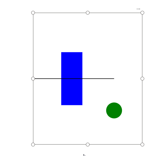
While everyone is using AI to replace core visuals with custom visuals using SVGs (I don’t like that trend), I do the opposite—turning my SVG … Read More
Power of Business Intelligence
Blog by Andrzej Leszkiewicz. Power BI Developer and Consultant.
Power of Business Intelligence
Blog by Andrzej Leszkiewicz. Power BI Developer and Consultant.
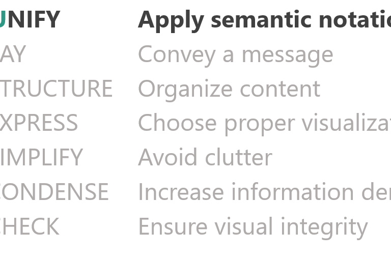
The International Business Communication Standards (IBCS) are practical proposals for the design of business communication. One focal point concerns the application of a semantic notation supporting the proper conceptual and perceptual design of charts and tables in reports, presentations, and dashboards. https://www.ibcs.com/ibcs-standards-1-2/
While everyone is using AI to replace core visuals with custom visuals using SVGs (I don’t like that trend), I do the opposite—turning my SVG … Read More
SVG image generated by a DAX measure allows the creation of custom charts embedded into Power BI core visuals (including slicers): table, matrix, new card, … Read More
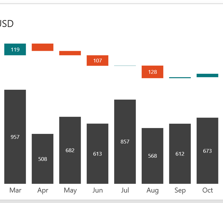
💁♂️Question: I have found that many struggle to completely understand the meaning of an IBCS visual with so much “busy-ness” with labels and arrows It’s … Read More
Many people are excited to see my IBCS-styled Power BI data visualizations. They look cool! However, not everyone understands why some columns are solid black, … Read More