Power BI is a powerful BI tool with a strong “back-office” (ETL, data modeling, DAX), but its “front office” (data visualization – what end users see) has limited capabilities. It’s 2022 and Power BI native visuals still don’t allow you to fully control even the most important attribute of any data visualization – color. Conditional formatting was only partially implemented (try a line chart with a legend for example). A lot of custom visuals are available in AppSource, but most of them is an attempt to add a certain chart type or to improve a certain native visual, and each of them has its own limitations.
Deneb (certified custom visual for Power BI) is different. It’s not adding a certain chart type to your report. It works like a window (or rather a powerful telescope) from the world of data (Power BI) into the world of data visualization. It allows you to insert Vega and Vega-Lite visualizations into a Power BI report. There is no similar to Excel or other Power BI visuals visual interface to access chart properties, but you have full access to all the properties by defining them in JSON format.

Your JSON code defines what will be rendered on a screen – line chart, bar chart, heatmap, scatter plot, treemap or a horse:

You can combine multiple charts and multiple axes:

US Presidential Election Chart – a combination of 4 bar charts and 4 axes, created in Vega by Andrzej Leszkiewicz
You can use all available visual “marks” (lines, rectangles, arcs, symbols, SVG images, text and others) to create a new chart type:

You can put your custom chart into a grid to create small multiples:

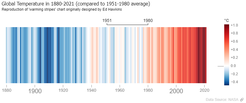
You can reproduce a chart like NYT spiral graph:

Deneb and Vega give you almost endless possibilities. And what is really great, now you can combine Power BI strongest part (ETL, data modeling, VertiPaq engine) that allows you to mange large amounts of data with amazing visualizations. The following is an embedded Power BI report with 4.4M rows in a fact table and 30K data points on a chart:
It takes about 3 seconds to render, but try to build such beautiful chart (with 30K data points) in Power BI without Deneb.
You can be more creative (invent a new chart type) or less creative (add minor details to an existing chart type, format it in a better way), but with Vega you have fully control over any element of your visualization (data mark type, titles, labels, fill color, fill opacity, stroke color, stroke width, stroke opacity, font color, font size, font weight, x and y coordinates and many many others). The full list of properties is really long.


But it’s just a beginning of your journey into a new Data Visualization Galaxy. Vega is interactive. So much interactive that you can build a game (e.g. Pacman) and embed into your Power BI report. Well, Power BI is about Business Intelligence, how Pacman is useful here? Pacman is just a great example of what level of interactivity is possible. Any element of your chart can react to different events (mouse hover, mouse click, timer, key press etc.). You can build an animation:
You can add control buttons (pause/play, backward, forward) to your animation:
There are many more things you can do with Vega.
Vega is built on top of D3. But while D3 is a JavaScript programming library, Vega is a declarative language and provides more convenient yet powerful means for data visualization. To start using Vega you don’t need to know JavaScript. Vega JSON code is much more human friendly description of what you want to see on the screen. Using Vega you can focus on the desired visual properties of you data visualization.
But also there is a simplified version of Vega – Vega-Lite. Vega-Lite was built on top of Vega. With Vega-Lite you have a bit less control over the visualization properties, but you write much less JSON code. With a few rows of Vega-Lite JSON code you have a chart and the default properties are not bad. Then you can add a bit more code to get what you need. I’m impressed looking at the beautiful examples created by Kerry Kolosko and Thys.
It’s up to you what to choose. During chart rendering Vega-Lite code will be compiled into Vega code anyway. Vega-Lite gives you many of Vega possibilities with less code. Vega gives you all possibilities of Vega. I needed full control over the details and I have chosen Vega. I used Vega-Lite examples a couple of times to compile them into Vega, so I can understand how a certain feature can be added (there were more good examples of charts created using Vega-Lite than using Vega). Now, when I understand Vega (but still don’t know 100% of its capabilities), I feel no need in learning Vega-Lite. At the same time for many people Vega-Lite will be better option. Less code – much better results than with any other previously available for a Power BI developer tools. Or you can learn both and use Vega-Lite for quick visual data exploration and Vega for thoughtful and creative data visualization.
I already see charts in my head when I read Vega JSON code and I can’t say it’s too time consuming to write Vega JSON code. Building a good visualization using native Power BI visuals, with all tricks and workarounds, expanding and collapsing all the groups on the Visualizations pane, in many cases will be much more time consuming.
And with Vega JSON code I can control the entire chart (all properties of all elements) from the same place. By the way, I prefer Vega Editor, it’s full screen and has better performance then code editor within Deneb visual. And I store my Vega code in a Github repository.
What is not so great about Deneb and Vega? Some customers will say you ‘No!’ if you’re willing to use Deneb and Vega. They will be afraid that support and maintenance of such report is a problem. And it is a problem. As long as Deneb and Vega are rare guests in the reports and therefore there are no many Power BI Deneb Vega developers. Also many people want to be able to choose a color using color selector. And what is that? JSON code with hex color codes? Sounds scary.
But in fact Deneb and Vega are really great tools. If not for self service BI then for professional report developers. Imagine Deneb visual is a native Power BI visual perfectly built-in into Power BI and fully integrated with Github. A lot of templates, version control, collaborative development, Microsoft’s support etc. Well, it’s just a dream for now. But in fact, with Deneb visual Power BI has already become so much better. Like Webb vs Hubble Telescope (in some cases vs looking at the sky with the naked eye). Start using Deneb and Vega (Vega-Lite) and build your own amazing data visualization galaxy. Build beautiful charts and share your knowledge with others. Let’s make Power BI data visualizations better together.
And say thank you to Daniel Marsh-Patrick, author of Deneb. Without Deneb Power BI and Vega would remain in two different worlds with an opaque wall between them.
"strokeOpacity": {"signal": "isDenebAvailable?0:1"}On this page I used only saved PNG images and recorded videos (+ one live Power BI report), but see Vega Data Visualization Examples for live (embedded) Vega charts and links to my public Github repository with Vega JSON code and CSV data files for all of the chart examples. Yeah, this is one more advantage of Vega. The same chart (at least one that doesn’t require Power BI backend for data management) can easily be embedded into any web page (without using Power BI) as well as into Power BI (using Deneb custom visual).