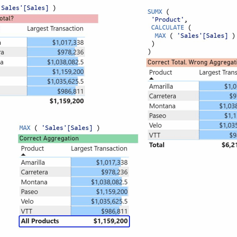
The total row in a Power BI table: Is it wrong?
The total row in a Power BI table: Is it wrong? Let me tell you about the complexity of DAX, misleading terms like aggregators and … Read More
Power of Business Intelligence
Blog by Andrzej Leszkiewicz. Power BI Developer and Consultant.
Power of Business Intelligence
Blog by Andrzej Leszkiewicz. Power BI Developer and Consultant.
The total row in a Power BI table: Is it wrong? Let me tell you about the complexity of DAX, misleading terms like aggregators and … Read More
👨⚕️ Healthcare professional (doctor): “I diagnose illnesses and choose treatments based on statistically verified protocols. A client chooses a hospital but does not tell the … Read More
Your BI report isn’t “cool”? It lacks “cool” backgrounds, effects (3D, shades, gradients), and “cool” images and icons, etc.? Do you want to make your … Read More
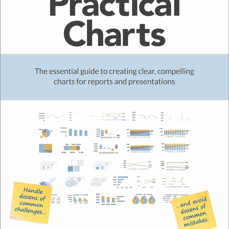
Nick Desbarats’s Practical Charts is an amazing and really practical book that will help you make good charts. Extremely high-quality content on high-quality (heavy!) paper, … Read More
I’ve just (almost) fallen into a dangerous data visualization pitfall. It was a usual LinkedIn discussion of a data visualization experiment. I realize that the … Read More
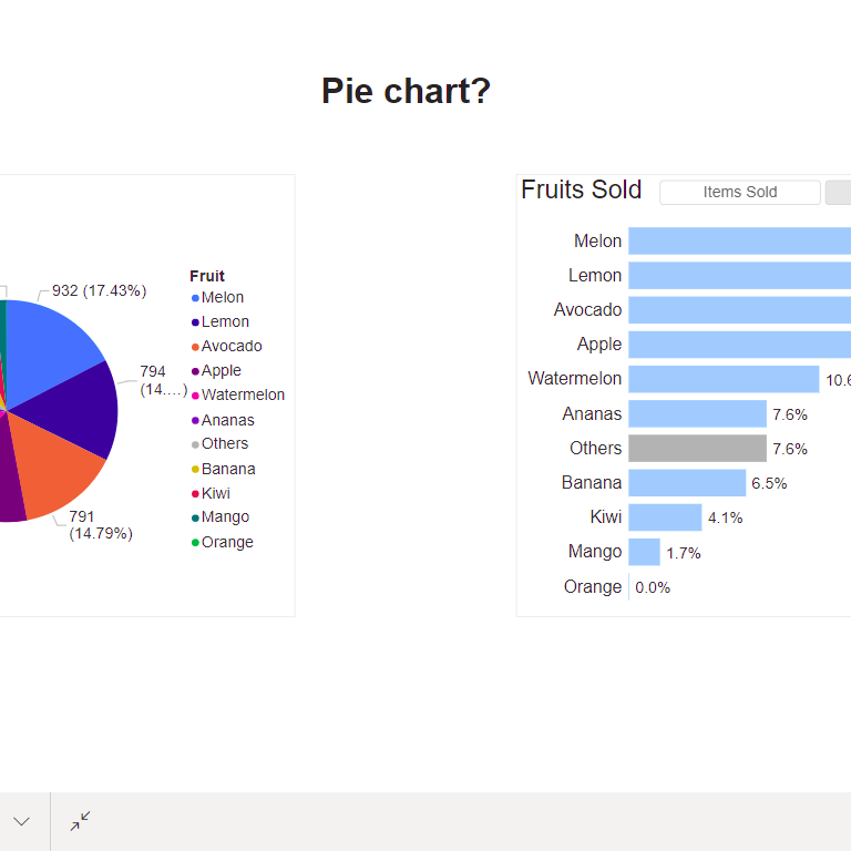
While explanatory reports should be intuitively easy to understand without any legends and tutorials, tools for data exploration may benefit from some complexity and therefore … Read More