Practical Charts: The Essential Guide to Creating Clear, Compelling Charts for Reports and Presentations
Nick Desbarats’s Practical Charts is an amazing and really practical book that will help you make good charts. Extremely high-quality content on high-quality (heavy!) paper, heavy enough to kill bad data visualization practices. 😀
But if you’re a Power BI developer, it’s also the best advertisement for Deneb and Vega.
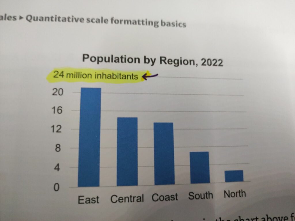
Axis Y labeling like this?
Vega JSON:
"axes": [
{
...
"encode": {
"labels": {
"update": {
<your solution is here>
And so on.
To make good charts, you need to know what makes charts good (read the book), and you need to have a tool that makes it possible.
If you have the best tool but no knowledge, you’ll most likely produce bad charts.
If you have the knowledge but your tool is limiting you, you’ll most likely produce much better charts, but it will require a lot of time and patience.
It’s better to have both—a good book and a good (flexible enough to follow the guidelines from the book) tool. It’s even better to have a tool that creates good charts by default.
Perhaps in the distant future, in a faraway galaxy, the best advice for the majority of users on how to make better charts will be, “Just don’t change the default AI-driven formatting settings; they are good enough for your everyday charts.”
We’re not there yet; we’re far from it. Here and now, you need good books to understand what and why to change in your charts. Then comes the easiest part of the solution—learning how to make those changes, whether through Vega, SVG, or various tricks and workarounds.