Skip to content
Power of Business Intelligence

Power of Business Intelligence

Blog by Andrzej Leszkiewicz. Power BI Developer and Consultant.

  • Home (Blog)
  • Bad and Good Charts in Power BI
  • IBCS
  • Deneb and Vega ⭐
    • Deneb and Vega Overview
    • Posts about Deneb and Vega
    • Deneb Vega Templates
    • Custom Vega Visualizations
    • Deneb Vega Help
  • Power BI Reports 📈
    • Profit and Loss
    • HR Cross-Function Mobility
    • Call-Center
    • Climate Change
    • COVID-19
    • IBCS
    • Population Pyramid
    • ——
    • Deneb Vega Templates
    • Bad and Good Charts in Power BI
    • ——
    • Storytelling with Data in Power BI
    • Power BI Embedded Demo
    • Publish to Web “Security”
  • Books to Read
  • YouTube
  • About
Power of Business Intelligence

Power of Business Intelligence

Blog by Andrzej Leszkiewicz. Power BI Developer and Consultant.

  • Home (Blog)
  • Bad and Good Charts in Power BI
  • IBCS
  • Deneb and Vega ⭐
    • Deneb and Vega Overview
    • Posts about Deneb and Vega
    • Deneb Vega Templates
    • Custom Vega Visualizations
    • Deneb Vega Help
  • Power BI Reports 📈
    • Profit and Loss
    • HR Cross-Function Mobility
    • Call-Center
    • Climate Change
    • COVID-19
    • IBCS
    • Population Pyramid
    • ——
    • Deneb Vega Templates
    • Bad and Good Charts in Power BI
    • ——
    • Storytelling with Data in Power BI
    • Power BI Embedded Demo
    • Publish to Web “Security”
  • Books to Read
  • YouTube
  • About

Tag: maps

Shape Map
Bad and Good Chart in Power BI Data Visualization

Shape Map

Andrzej Leszkiewicz July 24, 2021

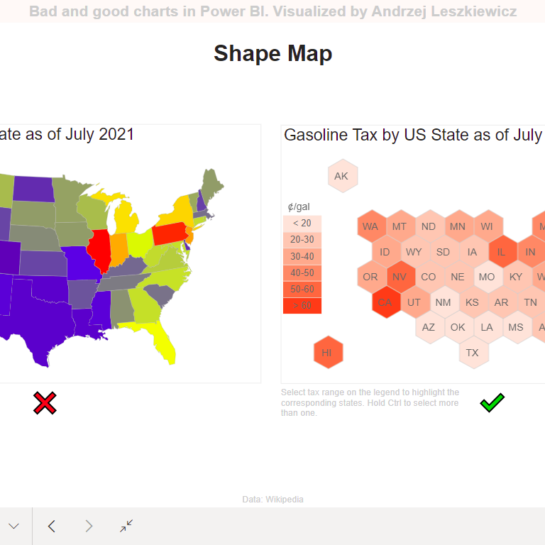
Why the map on the left is bad? Try to find Rhode Island or Delaware. Small states are almost invisible, large states are taking too … Read More

choropleth mapgood and bad chartsmaps

Newsletter

Recent Posts

  • The total row in a Power BI table: Is it wrong?
  • Power BI Embedded Demo
  • Fabric Deployment Pipeline Rule to set Data Pipeline Parameters
  • WoW 2025 Week 24 | Power BI Core Slicers Box Plot
  • Row Level Security → Default Slicer Selection

Categories

  • AI (4)
  • Books (16)
  • Consulting (6)
  • Data Modeling (6)
  • Data Preparation (2)
  • Data Visualization (56)
    • Bad and Good Chart in Power BI (8)
    • Data Visualization Examples (2)
    • IBCS (6)
    • Storytelling with data (14)
  • DAX (2)
  • Deneb-Vega (6)
  • Excel (1)
  • Fabric (2)
  • Performance (1)
  • Power Query and M (2)
  • REST API (4)
  • Sharing and Embedding (2)
  • Tabular Editor (1)
  • Tricks and Workarounds (13)
  • Uncategorized (2)

Selected Visualizations

  • Home (Blog)
  • Bad and Good Charts in Power BI
  • IBCS
  • Deneb and Vega ⭐
    • Deneb and Vega Overview
    • Posts about Deneb and Vega
    • Deneb Vega Templates
    • Custom Vega Visualizations
    • Deneb Vega Help
  • Power BI Reports 📈
    • Profit and Loss
    • HR Cross-Function Mobility
    • Call-Center
    • Climate Change
    • COVID-19
    • IBCS
    • Population Pyramid
    • ——
    • Deneb Vega Templates
    • Bad and Good Charts in Power BI
    • ——
    • Storytelling with Data in Power BI
    • Power BI Embedded Demo
    • Publish to Web “Security”
  • Books to Read
  • YouTube
  • About
Proudly powered by WordPress | Theme: BusinessDeal | By Theme Freesia.