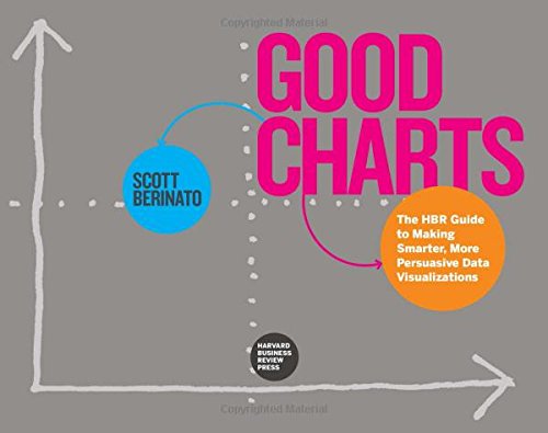
Good Charts: The HBR Guide to Making Smarter, More Persuasive Data Visualizations
I read multiple books about data visualization (by Edward Tufte, Alberto Cairo, Stephen Few, Cole Nussbaumer Knaflic, Jonathan Schwabish and other authors). Therefore, before buying a new unknown to me book I always ask myself a question – do I need one more dataviz book?
I did not know I needed this book. But I am happy that I bought this book. Good Charts is an excellent book. It provides a brief overview of data visualization history and visual perception. And it explains how to build good charts. But it is not a bunch of strict rules. The book just helps you to ask right questions (including questions to yourself), to understand what type of data visualization you need, to sketch and to prototype, to ask more questions and to refine your data visualization for better persuasion, but not for manipulation. It helps you to present your work and it gives you a great advice about constant practicing. The book even teaches you about how to speak about bad charts (in social media) to make dataviz community more pleasant for all of us (dataviz professionals and newbies).
Good Charts is not a manual, and it is not an impractical philosophy book. It is a data visualization thinking enabler and it is a guide on your way into the world of better charts. And Scott Berinato is a great coach.

