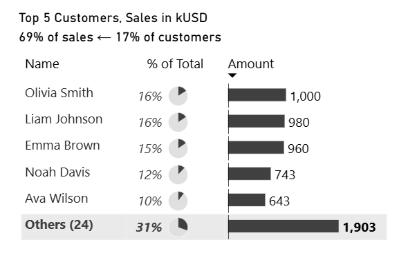
Top N + Others Without Any Changes in the Data Model
To show Top N records and all other records grouped into “Others” in Power BI, we used to create a new table in the data model, including a list of dimension items and an additional “Others” row.
Not anymore!
This chart is created without any changes to the data model, demonstrating a simpler and more flexible visual-level approach.
🔥 This is an interactive visual from a Power BI report embedded into this page using Power BI Embedded.
Instructions
Install PowerofBI.IBCS UDFpackage (version 0.2.0). To reproduce the above visualization you will need PowerofBI.IBCS.BarChart.AbsoluteValues and PowerofBI.IBCS.Extras.PieChart.PctOfTotal user-defined functions.
Or just download https://github.com/avatorl/PowerBI-IBCS/blob/main/UDF/DAX-UDF-SVG-IBCS-Examples-0.2.0.pbix with the example. See TopN and Other page.
There is a matrix visual with ‘Customer'[Name] in Rows.
And the following measures in Values (columns):
Column “Name”
-- Returns "Others (<number of customers>)" string
VAR PersonsInSelection =
    -- customers in the table
    ALLSELECTED ( 'Customer'[Name] )
VAR _Count =
    -- number of customers not in the table
    CALCULATE (
        COUNTROWS ( 'Customer' ),
        FILTER ( ALL ( 'Customer'[Name] ), NOT 'Customer'[Name] IN PersonsInSelection )
    )
VAR _Result =
    -- returns "Others (<number of customers>)" string
    IF (
        ISINSCOPE ( 'Customer'[Name] ),
        SELECTEDVALUE ( 'Customer'[Name] ),
        "Others (" & _Count & ")"
    )
RETURN
    _Result
Used by other measures
// Sales for customers that are not in the table (not in ALLSELECTED)
VAR PersonsInSelection =
    -- customers in the table
    ALLSELECTED ( 'Customer'[Name] )
VAR _Result =
    -- Sales amount for customers not in the table
    CALCULATE (
        SUM ( 'Sales B'[Amount] ),
        FILTER ( ALL ( 'Customer'[Name] ), NOT 'Customer'[Name] IN PersonsInSelection )
    )
RETURN
    _Result
Column “% of Total”
// Return SVG image with a pie chart and % of total data label
VAR _IsTotalRow =
    -- is it a total row
    NOT ( ISINSCOPE ( 'Customer'[Name] ) )
VAR _Total =
    -- total sales
    CALCULATE ( [AC B], ALL ( 'Customer'[Name] ) )
VAR _ValuePct =
    -- % of total for the selected row or of the rows that are not in the table ("Others")
    DIVIDE (
        IF ( _IsTotalRow, [Other Sales B], [AC B] ),
        _Total
    )
VAR _Result =
    PowerofBI.IBCS.Extras.PieChart.PctOfTotal (
        _ValuePct,
        FORMAT ( _ValuePct, "#,0%" ),
        _IsTotalRow,
        TRUE (),
        0,
        0
    )
RETURN
    _Result
Column “Amount”
// Returns SVG image with a bar chart
VAR _IsTotalRow =
    -- is it a total row?
    NOT ( ISINSCOPE ( 'Customer'[Name] ) )
VAR _ScaleMax =
    -- max value for scaling
    MAX (
        [Other Sales B],
        MAXX ( ALLSELECTED ( 'Customer' ), [AC B] )
    )
VAR _Result =
    PowerofBI.IBCS.BarChart.AbsoluteValues (
        IF ( _IsTotalRow, [Other Sales B], [AC B] ),
        BLANK (),
        BLANK (),
        "grey",
        FORMAT ( IF ( _IsTotalRow, [Other Sales B], [AC B] ), "#,0" ),
        _IsTotalRow,
        TRUE (),
        _ScaleMax,
        0,
        0
    )
RETURN
    _Result
First column of the table is hidden, so we can use the second column (“Name”) to show the number of customers in the “Others” group.
Now just user Filter pane to add Top N (by sales amount) visual level filter:

How it works?
The Top N filter ensures that only the top N customers are included in the visual.
Therefore, the DAX function ALLSELECTED returns those N rows included in the table.
This filter then gives us all the other rows that are not included in the table (the customers in the “Others” group):
VAR _PersonsInSelection =
    -- customers in the table
    ALLSELECTED ( 'Customer'[Name] )
VAR _Others =
    -- other customers (not in the table)
    FILTER ( ALL ( 'Customer'[Name] ), NOT 'Customer'[Name] IN _PersonsInSelection )
Using this filter, we calculate the number of customers in “Others,” the sales amount for those customers, and their percentage of the total.
We then use user-defined functions to draw pie and bar charts based on these values, so the total row visually reflects the number of customers in “Others,” their sales amount, and their share of the overall total.
And while we can simply change the “Total” label to “Other(s),” it’s also possible to include the number of customers in the label. I made the first column (the row headers column) hidden by setting its width to zero and used a custom column named “Name” to display customer names as is in individual rows and “Others (<number of customers in Others group>),” for example, “Others (8)” in the Total row.


See PowerofBI.IBCS User-Defined Functions for more examples of my user-defined DAX functions for embedding data visualizations into core visuals.