Responsive SVG Charts in Power BI Core Visuals
SVG image generated by a DAX measure allows the creation of custom charts embedded into Power BI core visuals (including slicers): table, matrix, new card, button slicer, list slicer, and image.
But did you know it’s possible to make SVG images embedded into Power BI core visuals responsive?
It’s possible to change properties (position, size, color, visibility, etc.) of SVG elements using CSS styles and CSS variables. And this method works in Power BI core visuals!
Proof of Concept
To test this example, create a measure and change data category to “Image URL”:
Measure code:
SVG := “data:image/svg+xml;utf8,
<svg xmlns=’http://www.w3.org/2000/svg’ width=’200′ height=’200′>
<!– foreignObject that defines CSS variables –>
<foreignObject x=’-9999′ y=’-9999′ width=’1′ height=’1′>
<body xmlns=’http://www.w3.org/1999/xhtml’>
<style>
svg:root {
–bar-y-shift: -50px;
–bar-height-scale: 2;
–bar-color: #0000ff;
–circle-display: block;
}
@media (max-height: 300px) {
svg:root {
–bar-y-shift: 0px;
–bar-height-scale: 1;
–bar-color: #ff0000;
–circle-display: none;
}
}
</style>
</body>
</foreignObject>
<!– bar controlled by CSS vars –>
<rect x=’50’
width=’40’
style=’
y: calc(100px + var(–bar-y-shift, 0px));
height: calc(50px * var(–bar-height-scale, 1));
fill: var(–bar-color, steelblue);
‘
/>
<!– green circle (hidden <300px height) –>
<circle cx=’150′
cy=’160′
r=’15’
fill=’green’
style=’display: var(–circle-display, block);’
/>
<!– reference line –>
<line x1=’0′ y1=’100′ x2=’150′ y2=’100′ stroke=’black’ stroke-width=’1’/>
</svg>
“
In this SVG, a foreignObject is embedded inside the root <svg> element. The foreignObject allows you to include a small HTML document inside the SVG. That HTML block contains a <style> tag, and this is the key trick: CSS variables defined inside this HTML <style> become available to the rest of the SVG.
Inside the <style> block, two sets of CSS variable values are defined:
- Default values inside
svg:root - Alternative values inside a
@media (max-height: 300px)rule
(applied when the SVG rendering area becomes shorter than 300px)
When Power BI (or the browser) resizes the SVG container, the media query becomes active or inactive, and the CSS variables automatically update.
Available media queries:
@media (max-height: …)
@media (min-height: …)
@media (max-width: …)
@media (min-width: …)
The rest of the SVG elements (rect, circle, line) reference those CSS variables through var(--variable-name) inside their inline style attributes.
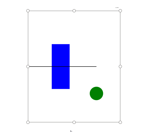
1. Rectangle (bar)
The bar uses three CSS variables:
--bar-y-shift→ shifts Y-position--bar-height-scale→ scales its height--bar-color→ changes its fill
So when height < 300px:
- The bar moves down (
--bar-y-shift: 0px) - The bar becomes shorter (
--bar-height-scale: 1) - The bar changes color (
--bar-color: #ff0000)
This gives you a fully responsive bar chart element inside a Power BI core visual.
2. Green Circle
The circle’s visibility is controlled by:
--circle-displayDefault:
--circle-display: block;Below 300px height:
--circle-display: none;The circle disappears entirely when the SVG height becomes too small.
3. Reference Line
The reference line does not use variables. It stays static — a good example of mixing responsive and fixed elements.
Documentation
<foreignObject>: https://developer.mozilla.org/en-US/docs/Web/SVG/Reference/Element/foreignObject
Using CSS custom properties (variables): https://developer.mozilla.org/en-US/docs/Web/CSS/Guides/Cascading_variables/Using_custom_properties
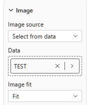
Add the measure into a new Image visual:
You should get this SVG image (depending on the height of the visual container, there will be either a red bar or a blue bar and a green circle):
Data Visualization Usage
The following video is an example of how this method can be used for creating a responsive IBCS-guided chart embedded into a Button Slicer:
Note: Work in progress. This is not the final version and is not 100% properly formatted.
By default, this chart contains 3 tiers: column chart (absolute values of actuals/forecasts and previous year), absolute variances (waterfall), and relative variances. When resized vertically below a certain height, the relative variance tier disappears. When resized further below another height value, the waterfall disappears and absolute variances are added as a (red or green-blue) variance bar directly to the column chart.
Once I have a polished and tested version, this chart will be included in my PowerofBI.IBCS package for DaxLib as a user-defined function (UDF).