
Metareport – Power BI Report of Power BI Reports
This Power BI report lists reports from a couple of workspaces in my Power BI tenant. But it’s more than just a list of reports; it’s a gallery of report thumbnails.

This dashboard is based on IBCS guidelines and was created using only core Power BI visuals: Matrix (Profit and Loss table with embedded waterfall charts) and the new Card (cards and column charts).

https://www.powerofbi.org/hr/The entire dashboard was created using a single instance of the Deneb custom visual and no other visuals.

Call-Center Interactions Dashboard
To create a dashboard that effectively helps users understand the data, we usually don’t need exotic chart types – just a few variations of bar or column charts, heatmaps, and line charts.

Climate change warning – custom data visualizations created using Deneb and Vega.
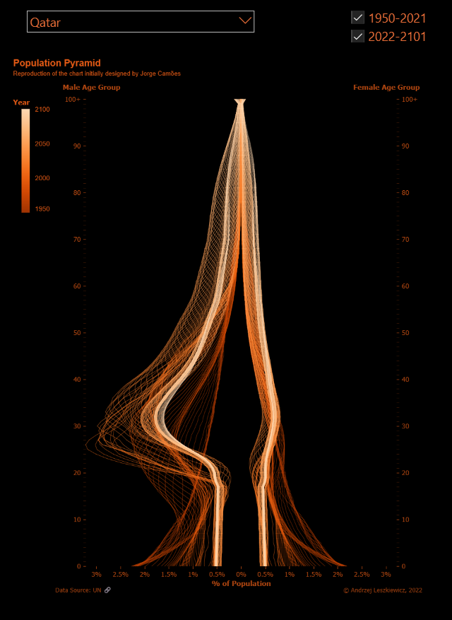
The chart crafted using the Vega visualization grammar and incorporated into the report through the Deneb custom visual comprises 150 series (years) and includes approximately 30,000 data points (150 years × 100 age ranges × 2 genders).
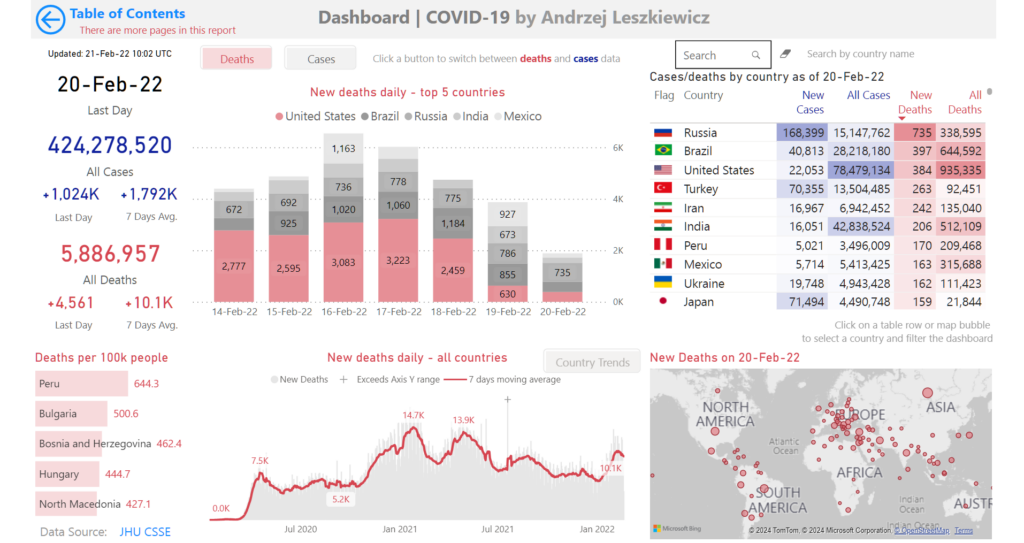
Many laughed when I inquired if they were ready for closed schools and kindergartens, overwhelmed hospitals, and various restrictions.
Then the government closed even forests. The data do not lie, if you know how to interrogate it.