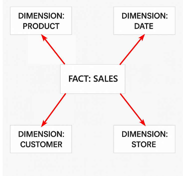
Multiple Stars in a Star Schema
Power BI developers learn that a star schema is the optimal data model design for usability and performance. However, seeing an ideal “star schema” with … Read More
Power of Business Intelligence
Blog by Andrzej Leszkiewicz. Power BI Developer and Consultant.
Power of Business Intelligence
Blog by Andrzej Leszkiewicz. Power BI Developer and Consultant.
Power BI developers learn that a star schema is the optimal data model design for usability and performance. However, seeing an ideal “star schema” with … Read More
A data model is not a feature; it’s the core of a Power BI report. You can create a great report without using additional features … Read More
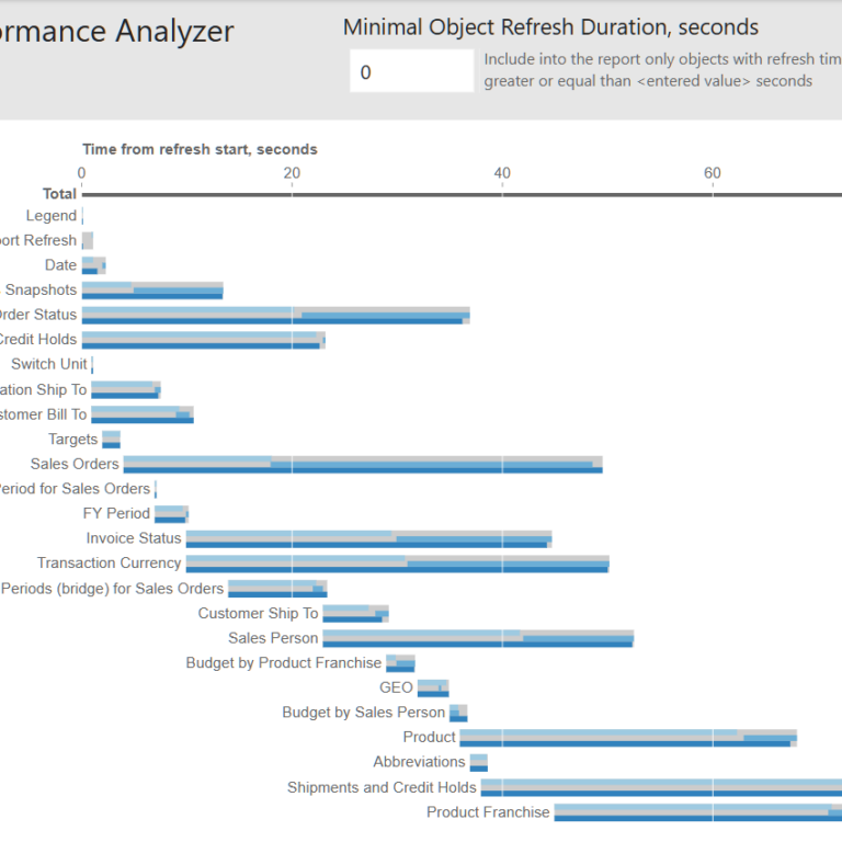
To understand why a Power BI report refresh takes too much time, we can use SQL Server Profiler. SQL Server Profiler can be connected to … Read More
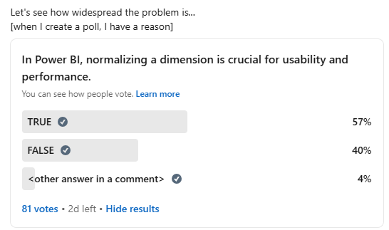
Okay, Power BI community, we have a problem. 80+ votes is already enough to confirm that we indeed have a problem. “In Power BI, normalizing … Read More
➡ Do not hesitate to append (do not merge) data with different granularity/different facts into a single table. You’ll need a column that identifies what … Read More
Welcome to my YouTube channel. First video has been published. Subscribe to see the upcoming videos. [youtube video=”https://www.youtube.com/watch?v=7pFXZU9xNHs&list=PL6qbun6zBOG2d9Ui2iq4Rl6Rj6-TAXMry”]
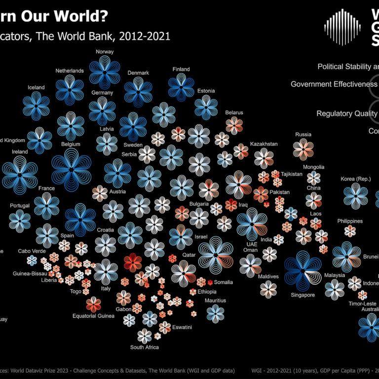
This data visualization was included into the World Data Visualization Prize 2023 poster longlist. The poster displays Worldwide Governance Indicators for 170 countries. Each flower … Read More
I needed to add a gantt chart into a report. I tried multiple visuals, but they didn’t work because they all require at least one … Read More
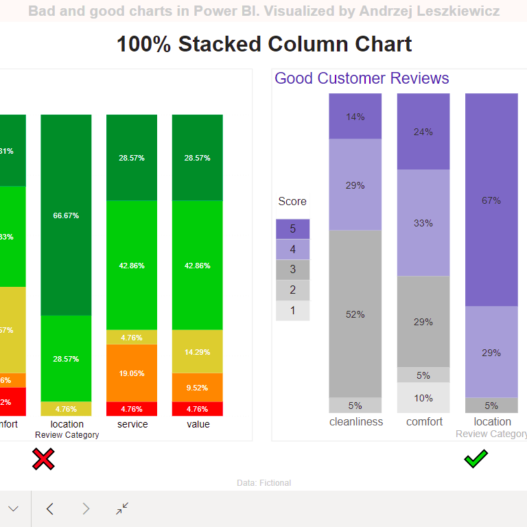
One more pair of good and bad charts created in Power BI. Why the chart on the left is bad, it’s so colorful?! Color in … Read More
I’ve already read many data visualization books, including The Big Book of Dashboards. And I was expecting high quality book from Steve Wexler. But this … Read More