How to Make “Cool” and “Fancy” BI Report
Your BI report isn’t “cool”? It lacks “cool” backgrounds, effects (3D, shades, gradients), and “cool” images and icons, etc.? Do you want to make your … Read More
Power of Business Intelligence
Blog by Andrzej Leszkiewicz. Power BI Developer and Consultant.
Power of Business Intelligence
Blog by Andrzej Leszkiewicz. Power BI Developer and Consultant.
Your BI report isn’t “cool”? It lacks “cool” backgrounds, effects (3D, shades, gradients), and “cool” images and icons, etc.? Do you want to make your … Read More
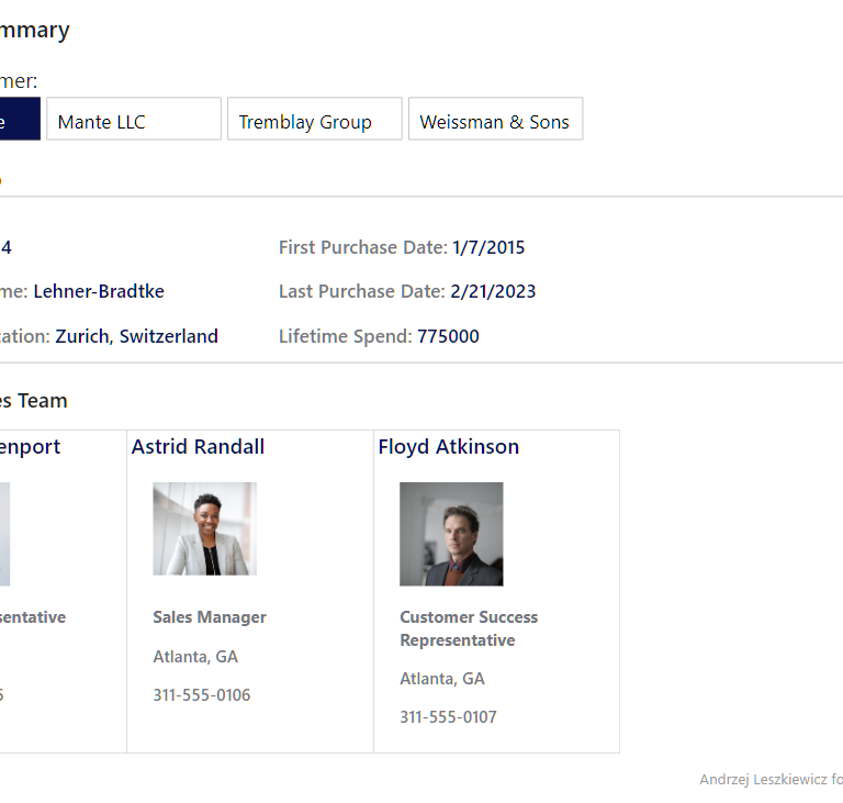
My version of WOW2024 Week 12 contact cards report created using only core visuals. The introduction of the challenge says “This week’s challenge uses a … Read More
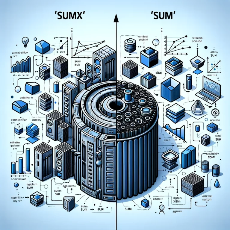
How common is this misunderstanding, and why does it exist? <false statement>“SUMX ( ‘Table’, ‘Table'[Column] ) is much more expensive (from performance point of view) … Read More
Think outside the box! AI is not intelligence. You’re intelligence. 👨💼User (me): Do you have “Do not create more than 1 image, even if the user … Read More
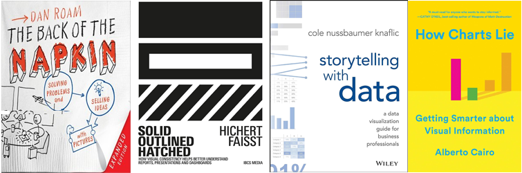
I recommend seeking an answer in the following books: Dan Roam’s “The Back of the Napkin” – an amazing book about solving problems and selling … Read More
While explanatory reports should be intuitively easy to understand without any legends and tutorials, tools for data exploration may benefit from some complexity and therefore … Read More
⚠ The visual part of business report development is often heavily underestimated (by developers and their customers – business users). Data preparation is important; data … Read More
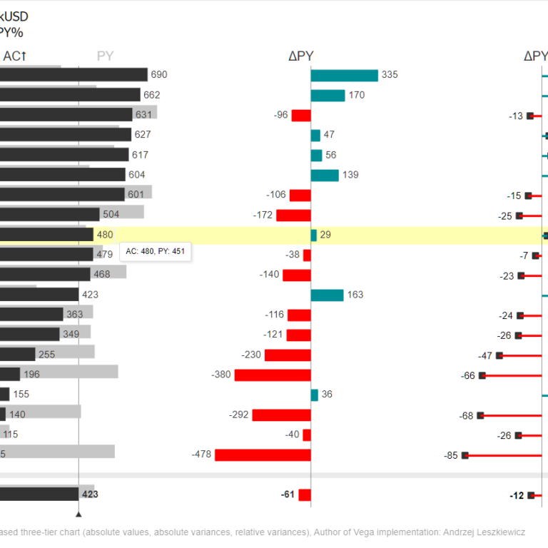
I’ve published a Power BI report with an example of a chart based on International Business Communication Standards. Live Power BI report: https://www.powerofbi.org/international-business-communication-standards/.
The following chart has been rendered using the most recent code version from my Github Deneb-Vega repository. Copy URL to this page/chart to clipboard
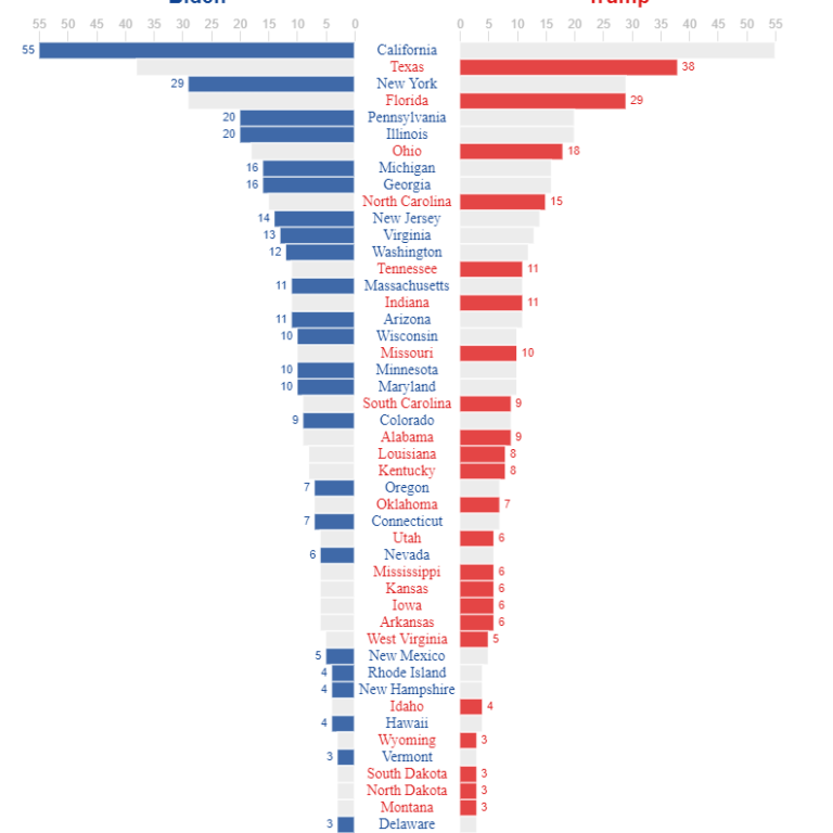
The Financial Times is a source of great data-driven stories told through data visualization. The Financial Times vocabulary poster is a simple yet comprehensive tool … Read More