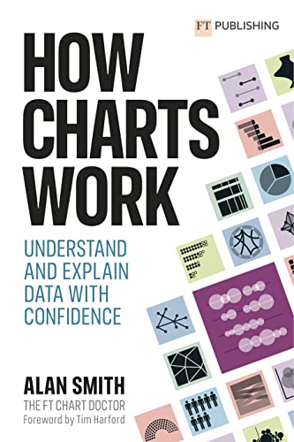
How Charts Work: Understand and Explain Data with Confidence
The Financial Times is a source of great data-driven stories told through data visualization. The Financial Times vocabulary poster is a simple yet comprehensive tool that helps many data visualization designers choose chart types that work better for each specific purpose.
This book, written by Alan Smith, who leads the FT’s newsroom team of data reporters and visual journalists, explains the reasoning behind the FT’s vocabulary and illustrates the vocabulary using well-designed FT charts and stories. Each example is based on an FT story and contains a link to the original FT article.
Alan explains what works better for what purpose and why. It’s not just a data visualization theory or a subjective essay, but years of experience in data storytelling for a wide audience and data visualization research.
This is a book that you’ll want to read once and then keep close at hand because you’ll need to reference it again and again when choosing how to tell a new data story.
I am eager to follow every link available under every chart in the book to read the corresponding FT articles and review all the charts in detail. And I wish the links were shorter. QR code could be a solution. But I would prefer a very short link like “ft.com/gH5”. Google Lens helps to enter long links such as “https://www.ft.com/content/a2901ce8-5eb7-4633-b89c-cbdf5b386938”. However, this has made me realize that URLs are a form of actionable data that deserve their own place in data visualization vocabulary.
To improve your data visualization literacy, print a large FT vocabulary poster, hang it on your wall and put this book on your table. Use them in your everyday data visualization work.
Thank you, Alan!

