Storytelling with data in Power BI: part 2
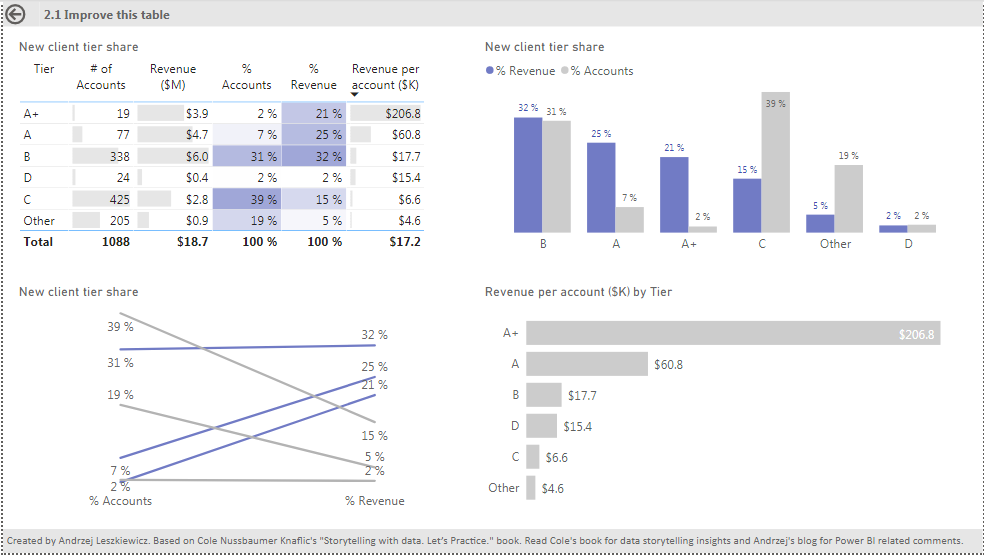
Since my first post about storytelling in Power BI I’ve created first 8 pages of the report :
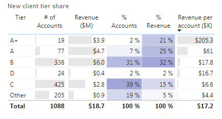
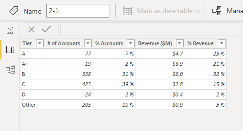
In some cases you may want to disable for example interactive features of table column headers (table sorting). You can hide part of a visual behind a transparent Rectangle, but it won’t work as expected. See the table on page 2.1 of the report.
I covered column headers with a transparent rectangle. It disables their interactivity while the table is not in focus. But if you clicked on any data cell in the table, then the table emerges and hides the rectangle. While the table is in focus you can click on column headers and change sorting order. If it lost focus (you clicked on any other visual) it goes back to it’s place behind the rectangle. This kind of behavior can confuse end users. Also it disables table’s visual header. I do not advise to use it to disable sorting.
Page 2.1 is based on the Chapter 2.1 of the “Storytelling with data. Let’s Practice.” book by Cole Nussbaumer Knaflic. Read the book for better understanding. My goal is to show how this data can be presented in Power BI (using built in visuals when possible).
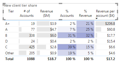
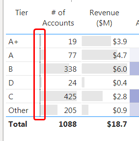
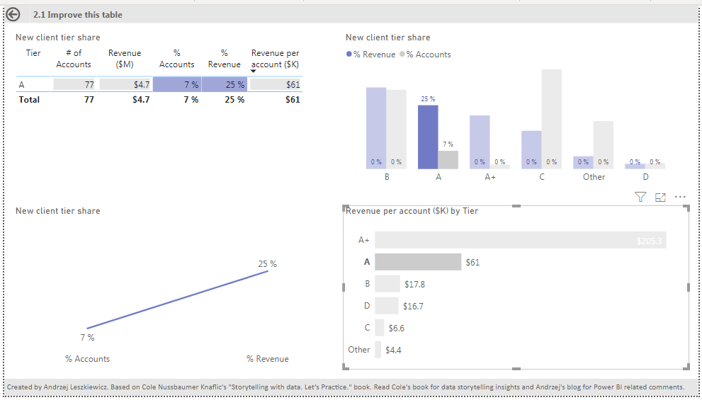
First of all I create a table visual and applied conditional formatting to the table. I assumed that end users will want to analyze tiers and revenue distribution first of all. So, I wanted to attract end users attention to % columns, not to $ columns. This is why I placed % columns one by one ($, $, %, % order instead of $, %, $, % order) and used blue color for this columns and light gray color for all other columns.
I also sorted the table by ‘Revenue per account ($)’ column id descending order, assuming that tiers with bigger revenue per account are the most important ones when we’re trying to analyze dependency between % of accounts and % of revenue.
Revenue per account :=DIVIDE ( SUM ( ‘2-1′[Revenue ($M)] ), SUM ( ‘2-1′[# of Accounts] ) ) * 1000
Two kinds of conditional formatting applied to the table columns:
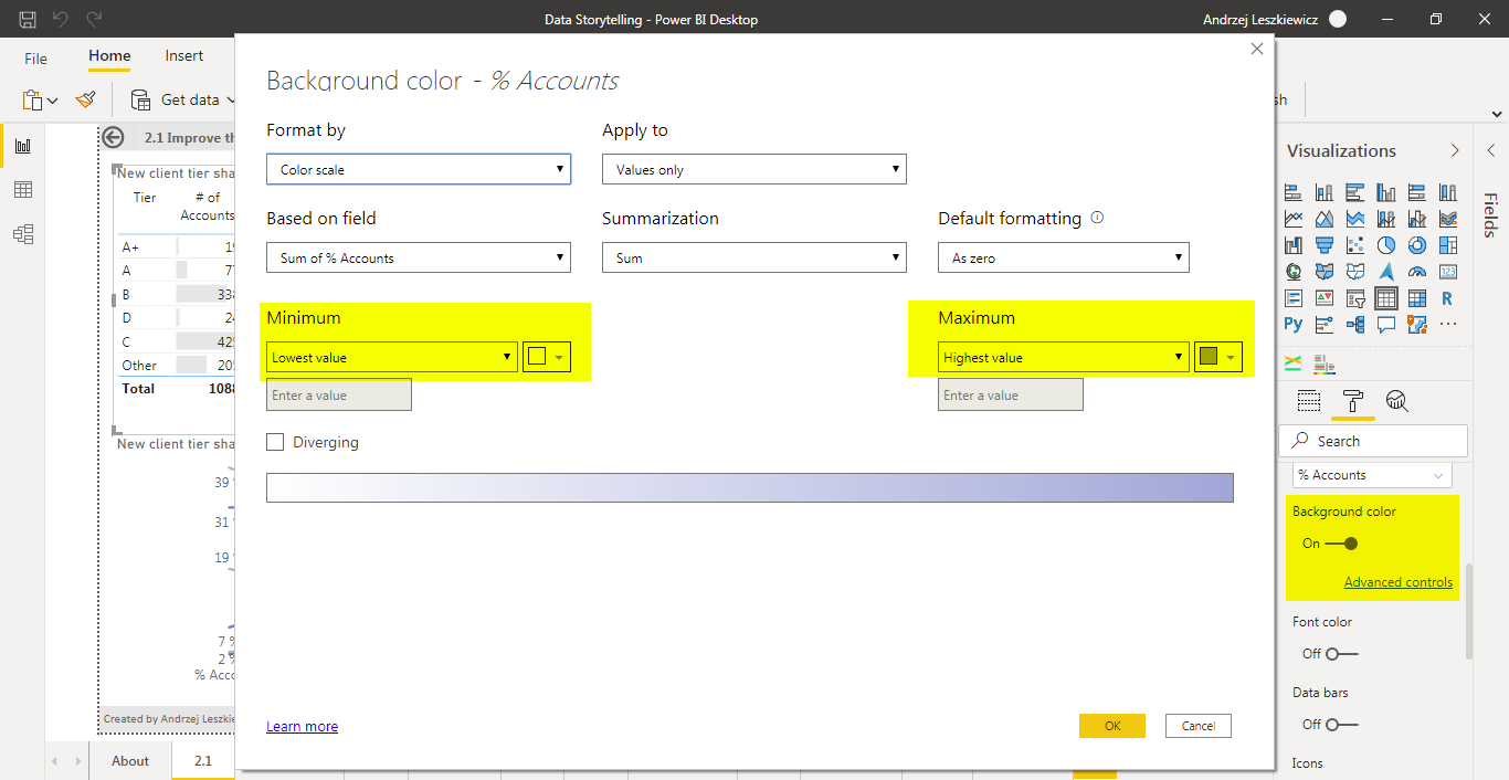
Background color for % columns (from white to blue)
And Data bars for $ columns (gray color).
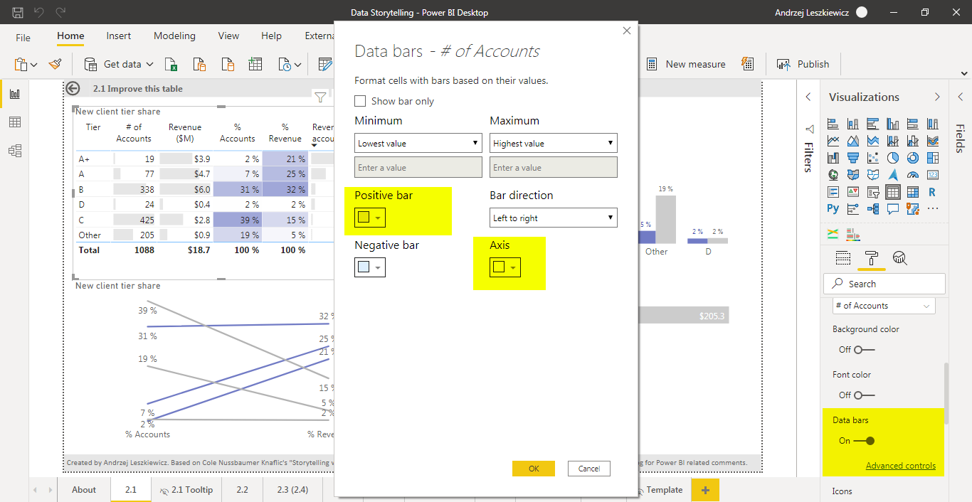
I don’t like how default black Axis looks like for data bars, so I use white color for the Axis. Black Axis is shifting viewers attention to the axis but provides no useful information.
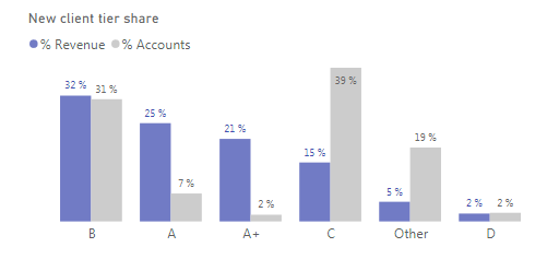
Second visual is a Clustered column chart. It allows to compare % Revenue and % Accounts distribution. I assumed that % Revenue is more important than % Accounts and used blue color for % Revenue and gray color for % Accounts. Also I sorted the graph by % Revenue by default.
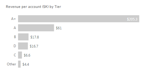
And I added Revenue pers account ($K) by Tier bar chart. It explains the first chart. If accounts in a tear create more $ of revenue then certain % of accounts in this tear gives us bigger % of revenue.
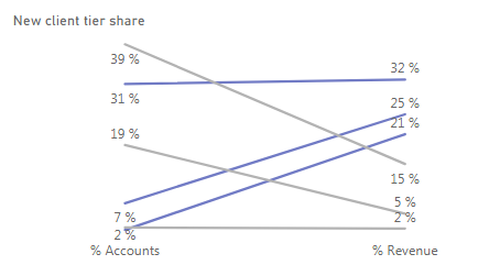
And I tried to build slope visual. You won’t find slope visual among built in Power BI visuals, but what you see is just a Line chart.
I used DAX to transform raw data table (used for other visuals on this page)
into a new table:
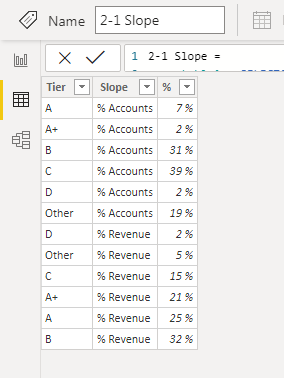
VAR _table1 =
SELECTCOLUMNS (
‘2-1’,
“Tier”, ‘2-1′[Tier],
“Slope”, “% Accounts”,
“%”, ‘2-1′[% Accounts]
)
VAR _table2 =
SELECTCOLUMNS (
‘2-1’,
“Tier”, ‘2-1′[Tier],
“Slope”, “% Revenue”,
“%”, ‘2-1′[% Revenue]
)
RETURN
UNION ( _table1, _table2 )
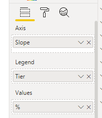
Slope column is what used as an axis X, Tier column is what used for a Legend field and % goes into Values field.
The problem here is how to add Tier names to the lines. Power BI line chart doesn’t allow to do that. If our goal is just to build a static illustration based on static data we can disable filtering and use text boxes to add tier names. But in Power BI usually we will want to build an interactive report with filtering enabled and with dynamically changing data (e.g. probably there will be more tiers in the future, or revenue distribution will change).
I decided to use a tool tip.
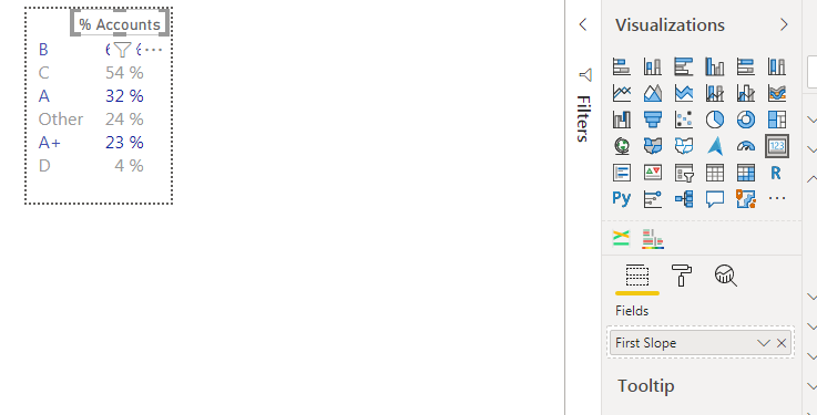
My tooltip is a table with Tier and % columns from the same DAX table that I used for the slope chart. The table is sorted by % in descending order.
But I needed dynamically changing header (it should be ‘% Accounts’ when hovering over left side of the slope chart and ‘% Revenue’ when hovering over right side of the chart. So, I covered table header with a Card visual.
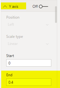
What was important to allow slope chart filtering is to set Axis Y limits (from 0 to 0.4). This allows to keep the same position (slope) of a visible line when the page is filtered by a tier.
But you should use axis limits very carefully (I wish to be able to use conditional DAX based limits). If in the future there will be a tier that has more than 40% of accounts or gives more than 40% of revenue it won’t work well with 40% limit I applied to the axis Y.
It’s important in Power BI to test all interactions on the page. Make sure that selecting an item doesn’t affect other visuals (by a filter applied) in a way you do not want them to be affected.
For me it was important to make sure that filtering by a tier just hides all other lines on the slope chart except one, but doesn’t changes line position and slope. So, I had to enter axis Y limits. Well, in this case I know that my data set is fixed and there will be no changes in the data.
But if you want to make sure it will work well with any future data changes than you probably will need to either disable interactions for the slope chart or use 1 (100%) as an upper Axis Y limit. You can use let’s say 0.5 (50%) if you’re sure that there it’s almost impossible for % account and % revenue to be greater than 50% for a tier, but if it will be greater you will be able to fix the report.
P.S. I think I’ll share the .pbix file only after the entire report and series of blog post will be finished. I’m going to make changes while I’m writing the posts and I don’t want to share multiple incomplete versions of the file. If you want to use it for leaning than my advice is to try to build your own report. Practice is what is important here. But feel free to ask any questions, read my blog and Cole’s book. And later I’ll share the .pbix file.