Power BI Map: bad or good?
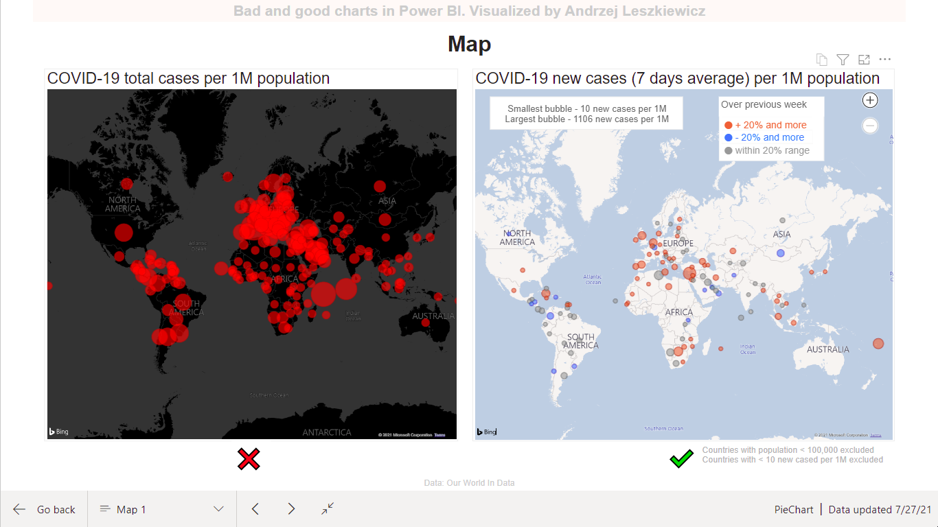
Did you see a map like the map on the left? A map like this was used as a main visual on one of the most popular COVID-19 dashboards in 2020. Does this map tell you anything about COVID-19, except maybe “The entire planet is red, we all are going to die”?
Is there a better way to use bubble map to show current situation with COVID19? First of all, showing total number of cases doesn’t make much sense on a dashboard (usually used to watch current situation) even when it’s a number of cases per 1M population. It says nothing about current situation. It looks much more insightful when bubble size shows average number of new cases (per 1M population) during last 7 days. Now we can see what countries are experiencing a new wave of the pandemic right now.
And then we can use color as a useful attribute – we can show where 7 days average number of new cases (per 1M population) increased (+10% and more), decreased (-10% and more) or didn’t change significantly (is within 90-110% range) compare to previous 7 days period. Now you can see some regional patters, countries and regions where situation is improving or worsening right now. Colors help you to understand data instead of just pushing a panic button.
And interactivity is also useful. Click on a legend row to highlight either countries with increasing, decreasing or relatively constant number of new cases and to mute all other bubbles to make certain regional patterns more visible.
Both maps are based on ‘Map’ Power BI visual. Map on the right also uses a ‘Table’ visual as a custom legend. And surely map on the right required more DAX (for conditional formatting mostly).
Note: It’s just an example, so I didn’t connect it to a live data source to be sure it won’t be broken by some future data source changes. It shows mid of July 2021 data.