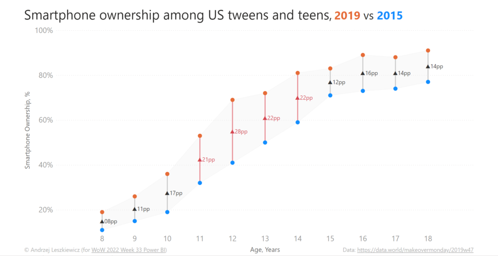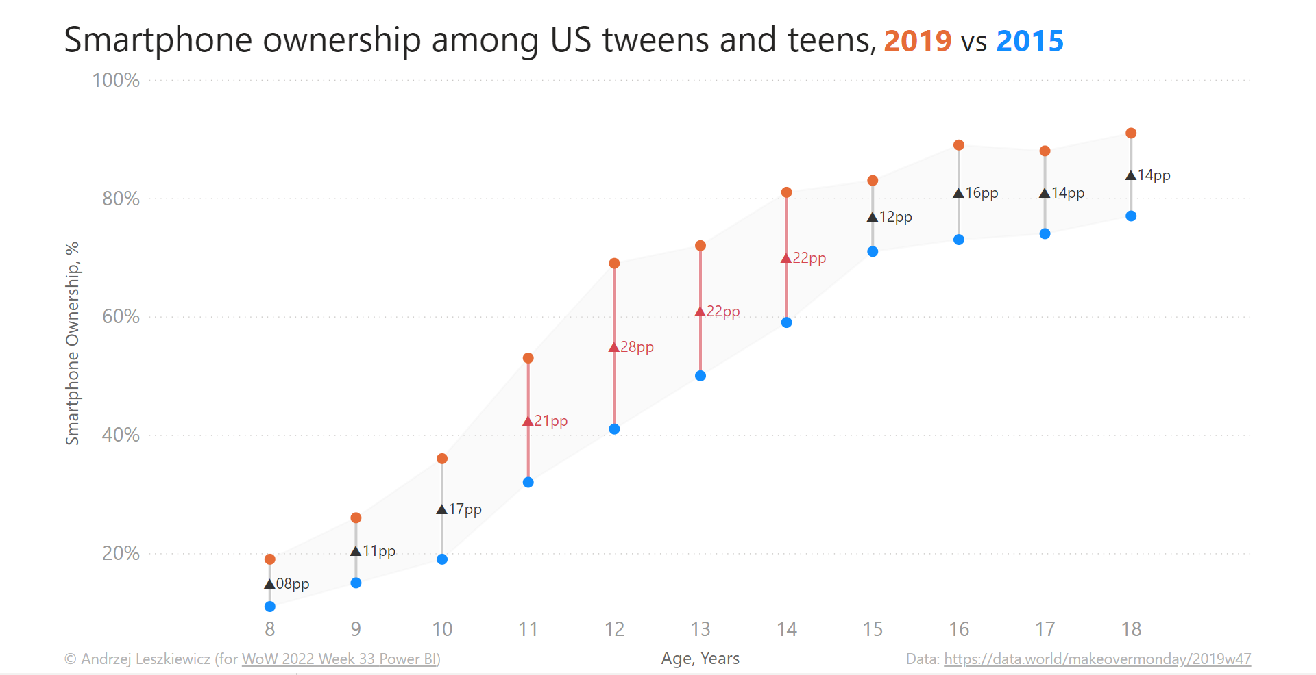
How to Breed a Unicorn? Dumbbell Chart in Power BI
It started with @shan_gsd‘s tweet about Year 2022 Week 33 of the Workout Wednesday and @CJMajka‘s reply “A dumbbell chart in #PowerBI?! That is kind of like a Unicorn right“
My first though was “A Power BI unicorn? I like Power BI unicorns and I believe I can use Error Bars (relatively new Power BI feature) to breed one specimen. It was late evening and time to go to sleep, but I couldn’t stop myself from creating a Unicorn.
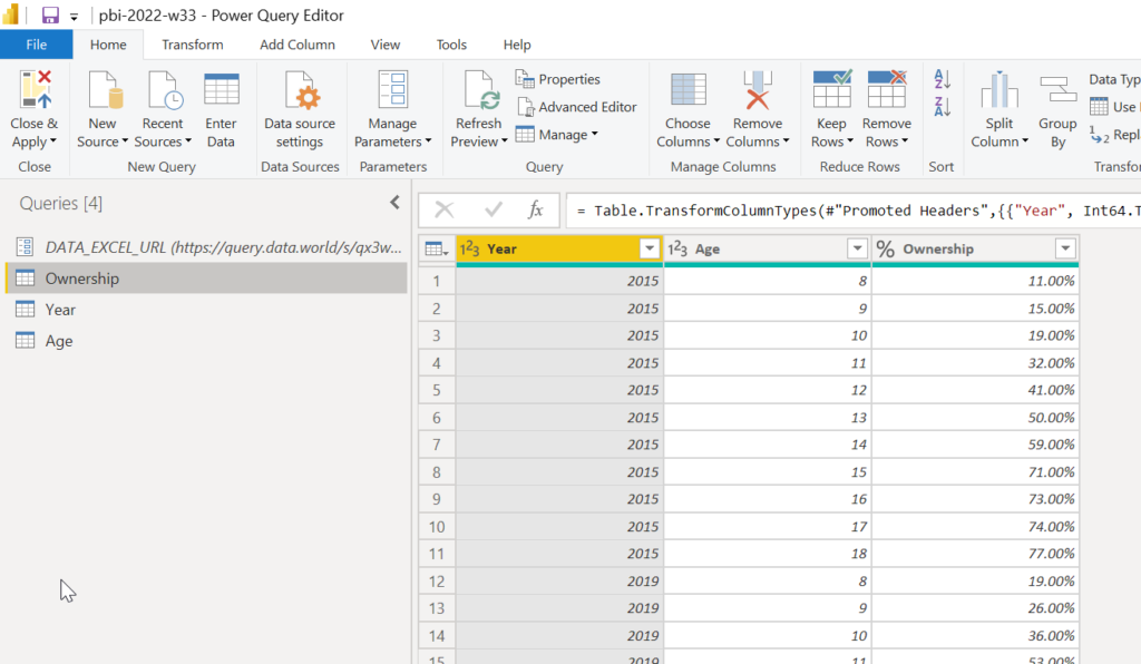
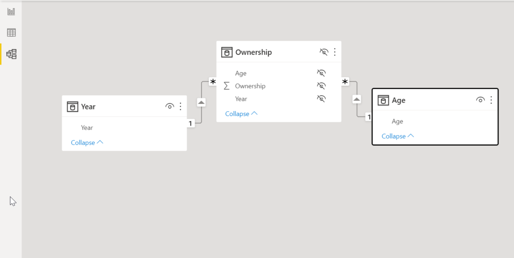
I loaded data into Power Query (a simple and short fact table with Year, Age and Ownership columns) + Year and Age dimension tables. Yeah, a proper star schema even for a very simple one chart report. It takes just a minute to build (with so simple fact table), but I think it’s a good habit.
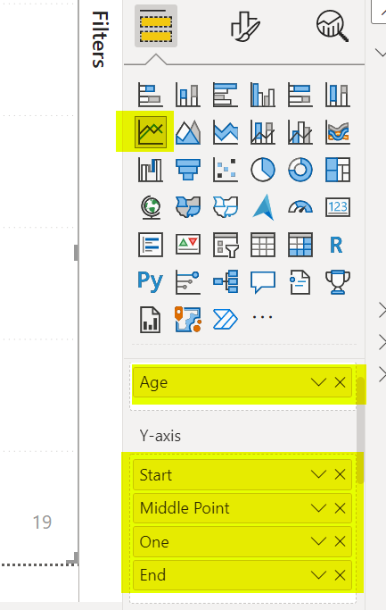
Next step is to add a native Line chart visual with ‘Age'[Age] column to X-axis field and multiple measures to Y-axis field.
First measure to create is [Ownership] measure.
Ownership :=//Average Ownership
CALCULATE ( AVERAGE ( ‘Ownership'[Ownership] ) )
Just an average of the ownership %.
This is the base for all other measures.
Now [Start] measure will be used for 2015 data (I’m just taking first available year to avoid hardcoded values):
Start :=//First Year ownership
VAR _Year = [First Year]
VAR _Result =
CALCULATE ( [Ownership], ‘Year'[Year] = _Year )
RETURN
_Result
And [End] measure will be used for 2019 data (I’m just taking the last available year to avoid hardcoded values):
End :=//Last Year ownership
VAR _Year = [Last Year]
VAR _Result =
CALCULATE ( [Ownership], ‘Year'[Year] = _Year )
RETURN
_Result
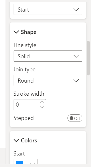
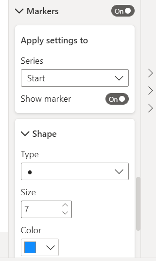
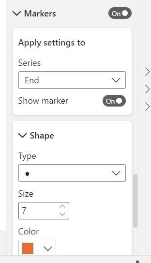
Format [Start] series to display only blue markers and no lines:
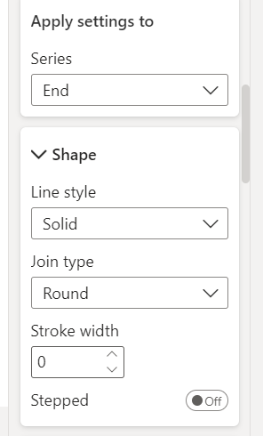
And format [End] measure to display only orange markers and no lines:
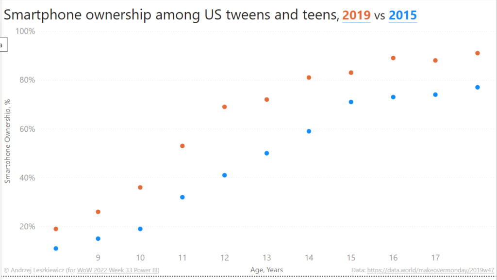
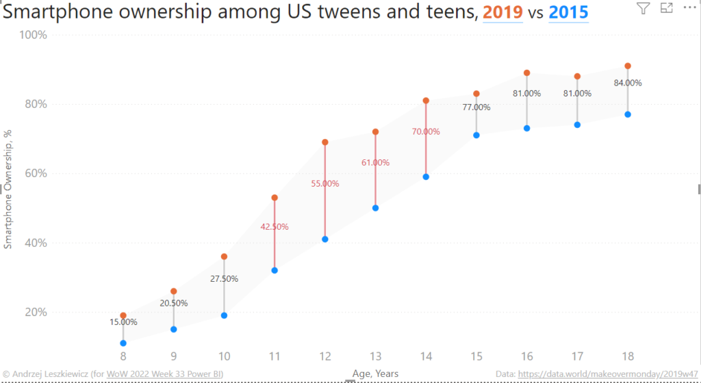
This is the chart with first two series added:
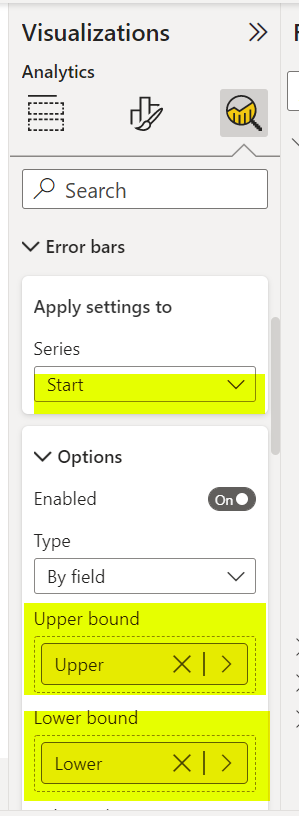
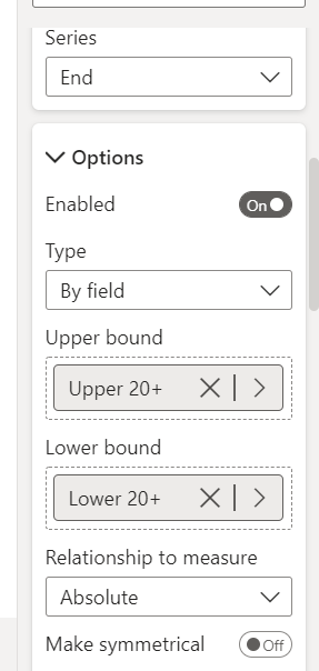
Firstly, I created [Upper] and [Lower] measures (error bar upper and lower bounds) and then [Upper 20+] and [Lower 20+] measures (error bar upper and lower bounds, but only for Age with 2019 vs 2015 change >= 20 percentage points.
Upper :=//Upper Value (either Last Year of First Year value)
VAR _Start = [Start]
VAR _End = [End]
VAR _Result =
IF ( _End > _Start, _End, _Start )
RETURN
_Result
Lower :=
//Lower Value (either Last Year of First Year value)
VAR _Start = [Start]
VAR _End = [End]
VAR _Result =
IF ( _End < _Start, _End, _Start )
RETURN
_Result
Upper 20+ :=
//Upper Value (either Last Year of First Year value)
//Only for change >= 20pp (to highlight with color)
IF (
[Change] >= 0.2,
[Upper],
BLANK ()
)
Lower 20+ :=
//Lower Value (either Last Year of First Year value)
//Only for change >= 20pp (to highlight with color)
IF (
[Change] >= 0.2,
[Lower],
BLANK ()
)
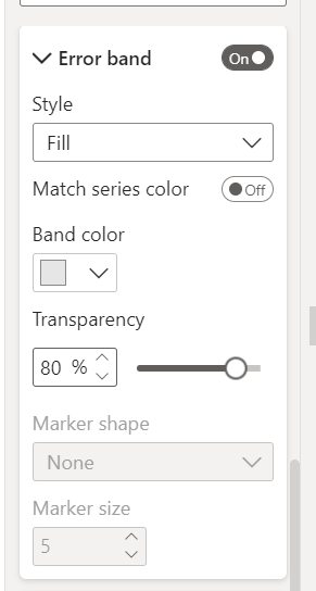
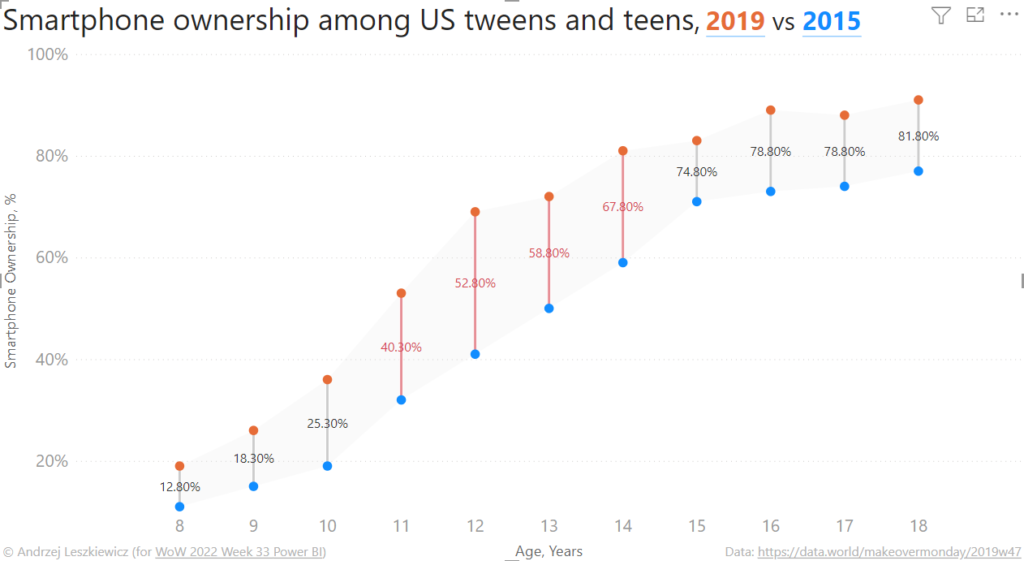
I added [Upper] and [Lower] measures to the [Start] series and formatted the error bars as gray bars (lines) with gray semi-transparent error band:
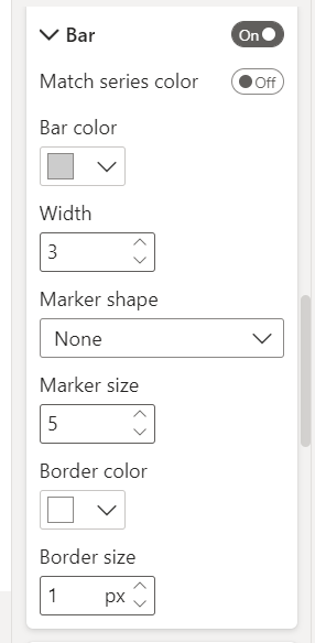
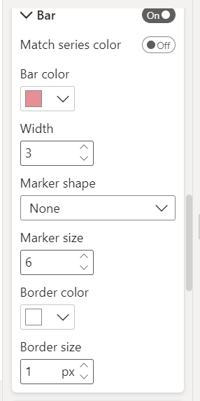
And I added [Upper 20+] and [Lower 20+] measures to the [End] series and formatted the error bars as red bars (lines):
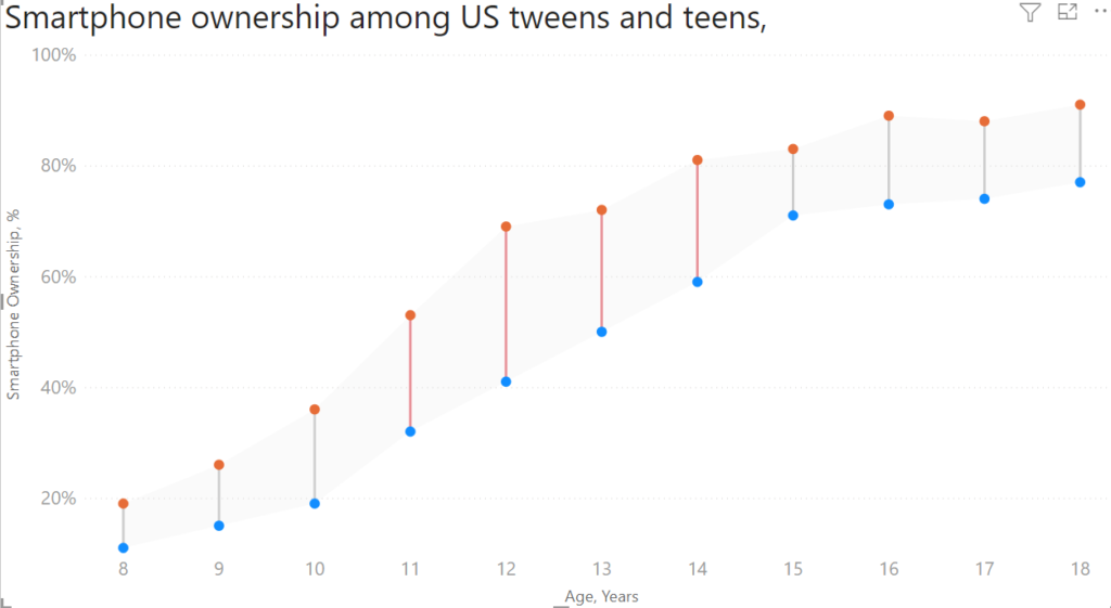
Errors bars is a really great feature.
But how to add a label to the middle of each error bar? This part is a bit more tricky.
I created [Middle Point] measure:
Middle Point :=//Invisible middle poin for a label
VAR _Start = [Start]
VAR _End = [End]
VAR _Shift = –shift data point down on the Y exis
( _End – _Start ) / ( ( ( _End – _Start ) * 100 ) ^ 1 / 2.2 )
VAR _Result = ( _End – _Start ) / 2 + _Start – _Shift
RETURN
_Result
Normally I would use (_End – _Start) / 2 + _Start to calculate the middle point between _Start and _End. But we can position data labels either below or above the data point. And I want the data point marker to be invisible, but the data label to be visible and placed in the middle of a error bar. This is what _Shift variable does. I display data labels above data points and use – _Shift to move the data point a little bit downward.
Without the _Shift:
Calculation Group.
I created ‘Number Format’ calculation group and added the following DAX to the Format String Expression property of the ‘Middle Point Label’ calculation item:
Middle Point Label :=//Format Middle Point (2019 vs 2015 change) data label
VAR _Change =
FORMAT ( ROUND ( ( [Upper] – [Lower] ) * 100, 0 ), “\\0\\0\p\p” )
VAR _ChangeDirection =
SWITCH (
TRUE (),
–triangle up https://unicode-table.com/en/25B2/
[End] > [Start], UNICHAR ( 9650 ),
–triangle down https://unicode-table.com/en/25BC/
[End] < [Start], UNICHAR ( 9660 ),
–diamond https://unicode-table.com/en/25C6/
–UNICHAR ( 9670 )
“”
)
VAR _ShiftX =
–spaces to shift label horizontaly
REPT ( UNICHAR ( 160 ), 8 )
VAR _MiddlePointFormat = _ShiftX & _ChangeDirection & _Change
VAR _Format =
IF (
–apply only to Middle Point measure
“‘_Measures'[“ & SELECTEDMEASURENAME () & “]”
= NAMEOF ( [Middle Point] ),
_MiddlePointFormat,
SELECTEDMEASUREFORMATSTRING ()
)
RETURN
_Format
_ShiftX variable is used to move data label to the right, so the triangle is exactly above the error bar.
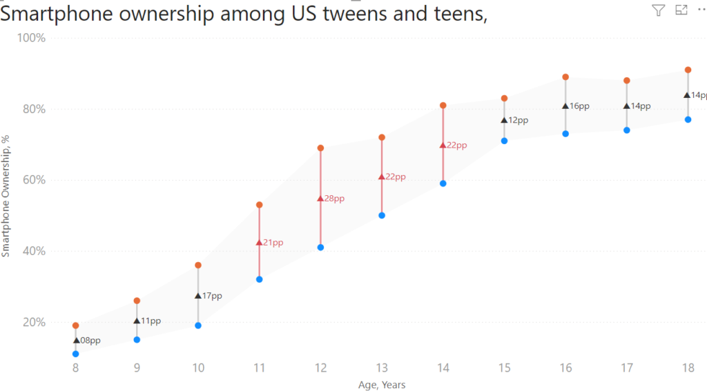
Now I have what I wanted:
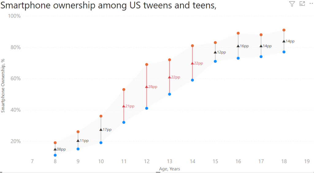
But there is a minor problem.
For the first and the last data points _ShiftX doesn’t work as I want it to work.
So far, the only solution I found is to add additional data points to axis X (I added Ages 7 and 19 to the ‘Age’ table in Power Query) and I added One measure to Y-axis (with hidden line/markers) to make sure all axis X values are included into the chart.
Then I formatted Axis X, Axis Y, added a title and a text box with “2019 vs 2015” text, a few foot notes and it’s complete.