“Business identity” vs Business Intelligence
🛑Coca-Cola reports = red in the reports
🛑Starbucks reports = green-bluish in the reports.
No! BI <> BI. In business intelligence, “business identity” is the last thing to consider.
“Identity” does not aid in data comprehension. On the contrary, standardization is beneficial. Reports based on IBCS (black + “Coca-Cola” red + “Starbucks” green-bluish) will work equally well, regardless of whether it’s Coca-Cola or Starbucks, or Mercedes-Benz.
A tiny logo in the corner is more than enough. A customized Power BI Service logo makes embedding the logo into report pages redundant.
Adding a branded line in the report header or footer likely won’t compromise your report. However, “business identity” should not serve as the base color for data encoding (e.g. for the bar chart bars). Use colors that help users (company’s employees) recognize what is important in the report, not colors that remind an employee of their employer’s “identity”; if they have access to the reports, they likely already know where they work.
Well, if Coca-Cola and Starbucks colors are both components of your “business identity,” you can incorporate IBCS as an element of your “business identity”.
P.S. My personal nightmares – bank apps with “branded” red “OK” buttons and “transaction successful” messages.
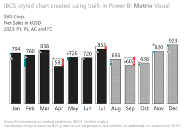
P.P.S. If anyone has missed. I have a video about creating this chart in Power BI native Matrix visual https://www.youtube.com/watch?v=28VechFLnuw. On my YouTube channel you’ll also find a few more videos about IBCS charts created in the native Power BI visuals. And I’ll be talking about this topic on the Power BI Summit (Feb 12-16th) https://globalpowerbisummit.com/.