How am I discovering new Power BI data visualization possibilities?
➡ I experiment and play with Power BI.
➡ I follow people who experiment and play with Power BI.
➡ When I see an interesting know-how I start my own experiments from scratch.
➡I share the results to let others experiment; together, we multiply and amplify the know-how.
Not all experiments are intended to represent the best practices of BI data visualization, but all experiments provide the knowledge and skills required for implementing the best practices of BI data visualization.
Subscribe to https://www.youtube.com/@power-of-bi to learn more about what is and isn’t possible in Power BI, which possibilities are useful in BI reporting, and which should never move from a silly experiment into a BI report.
A few results of the experiments:
A series of chart templates based on IBCS guidelines, compatible with Power BI core visuals (New Card, Table, Matrix). For highly efficient BI reports.
 Subscribe!
Various highly customized and interactive Deneb Vega data visualizations:
Highly customized (sadly not yet interactive) SVG data visualizations (for New Card, Table and Matrix visuals):
And there are many more results from various experiments – custom visualizations that I can’t show, as they were created for clients. But I can demonstrate various techniques useful for:
➡ Creating simple but more efficient data visualizations, overriding ‘ugly’ defaults and limitations of the core visuals for usual BI reporting (sales, finance etc.).
➡ Creating highly customized and interactive data visualizations for advanced analysis of complex data specific to certain industries.
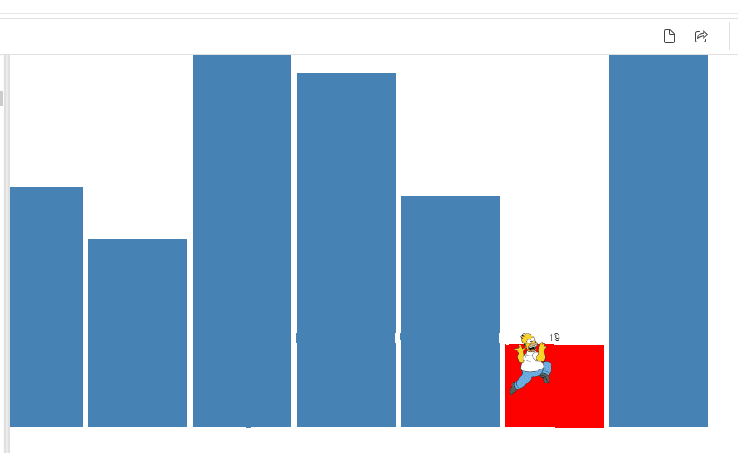
P.S. Should it be a column chart game?
Homer jumping from a column to a column and running away from a pie chart.
Yes, it’s possible to use keyboard and mouse events in Deneb Vega.