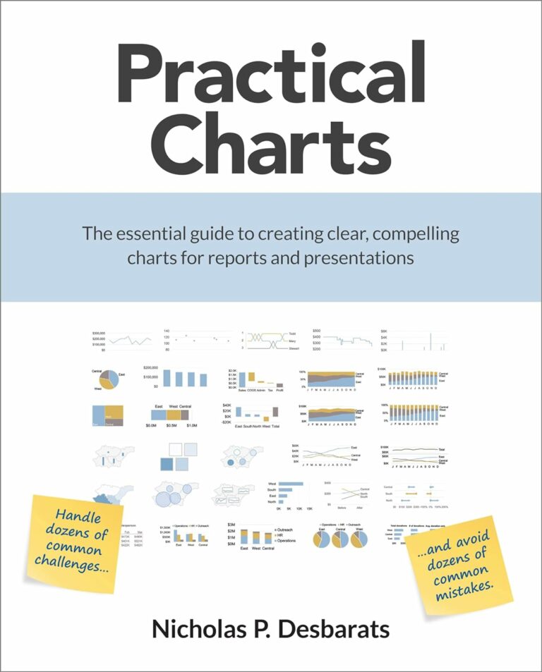
I created this report to show both bad and good practices of data visualization and to explain why some charts are worse and other charts are better in helping us to get useful insights from our data.
Each page of the report shows a pair of charts:
a bad chart (on the left, with ❌ mark) and a good chart (on the right, with ✔️ mark️).
Examples of the bad charts have been “inspired” by what you can easily find over the internet, some of them represent what Power BI documentation implicitly suggests us to use (just to show off a chart type). The good chart examples are based on the principles of perception, best practices of data visualization and my knowledge of how to use Power BI capabilities and how to bypass Power BI limitations.
Most charts in this report were created using native Power BI visuals, but in a few cases I used custom visuals. Power BI is being improved, but we still have no full control over the many important visual elements and their attributes (colors, labels etc.), default visual formatting settings are often questionable, fine-tuning is time consuming, and it is not always possible to find well working and easy way to implement workarounds for all the limitations. Although careful selection among native and custom visuals, thoughtful usage of the available formatting options, layering of multiple visuals, extensive usage of advanced DAX (calculation groups for example) helps us to make better charts.
This report doesn’t represent bad or good chart types. A pie chart on the ‘Pie Chart?’ page is a bad chart. A pie chart on the ‘Pie Chart!’ page is a good chart. Although basic principles of what is bad and what is good are usually appliable to all use cases, it’s important to understand that a chart is better or worse within a specific context, for a certain purpose and audience. A chart becomes bad because of inappropriate, for a specific task, chart type choice, cluttering, misleading (often default) formatting. At the same time a good chart is not a single source of truth, there are other alternatives.
The following links can be used to navigate between the report pages from outside of the report (for example, a link can be inserted into a social media post, if you want to discuss a specific report page): About | Pie Chart? | Pie Chart! | Line Chart with a Legend | Line Chart with a Legend 2 | Choropleth Map? | Scatter Chart | Bubble Map | Column Chart | Clustered Column Chart? | 100% Stacked Column Chart | Gauge? | Map with Pie Charts? | Treemap | Radar Chart
Posts about Bad and Good charts in Power Bi


YouTube videos about Bad and Good charts in Power Bi
A series of videos that highlights both good and bad practices in data visualization, and explains why some charts are more effective than others in helping us extract meaningful insights from our data.
 Subscribe!