Skip to content
Power of Business Intelligence

Power of Business Intelligence

Blog by Andrzej Leszkiewicz. Power BI Developer and Consultant.

  • Better DataViz
    • Posts about IBCS
    • IBCS in Power BI (native visuals)
    • Bad and good charts in Power BI
    • Storytelling with data in Power BI
  • Deneb and Vega ⭐
    • Posts about Deneb and Vega
    • Deneb and Vega overview
    • Deneb Vega templates
    • Custom Vega visualizations
    • Deneb & Vega help
  • PowerofBI.IBCS
  • Power BI Embedded
  • Power BI Reports 📈
  • Books to Read
  • YouTube
  • About
Power of Business Intelligence

Power of Business Intelligence

Blog by Andrzej Leszkiewicz. Power BI Developer and Consultant.

  • Better DataViz
    • Posts about IBCS
    • IBCS in Power BI (native visuals)
    • Bad and good charts in Power BI
    • Storytelling with data in Power BI
  • Deneb and Vega ⭐
    • Posts about Deneb and Vega
    • Deneb and Vega overview
    • Deneb Vega templates
    • Custom Vega visualizations
    • Deneb & Vega help
  • PowerofBI.IBCS
  • Power BI Embedded
  • Power BI Reports 📈
  • Books to Read
  • YouTube
  • About
Power BI Map: bad or good?
Data Visualization Data Visualization Examples Deneb-Vega

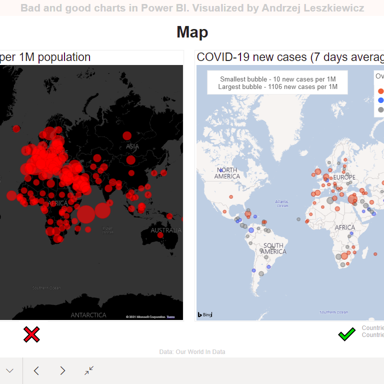
Power BI Map: bad or good?

Andrzej Leszkiewicz July 27, 2021

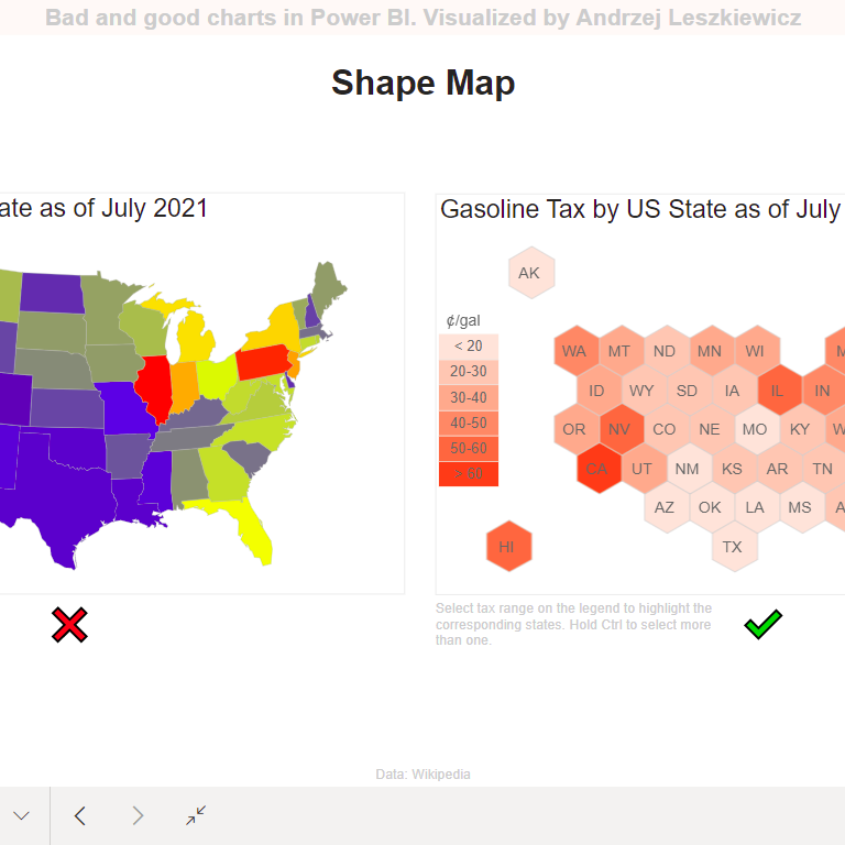
Did you see a map like the map on the left? A map like this was used as a main visual on one of the … Read More

map
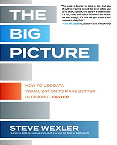
The Big Picture: How to Use Data Visualization to Make Better Decisions Faster
Data Preparation Performance Tricks and Workarounds

The Big Picture: How to Use Data Visualization to Make Better Decisions Faster

Andrzej Leszkiewicz July 27, 2021

I’ve already read many data visualization books, including The Big Book of Dashboards. And I was expecting high quality book from Steve Wexler. But this … Read More

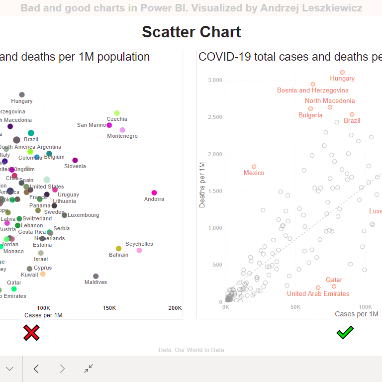
Scatter Chart
Data Visualization Sharing and Embedding

Scatter Chart

Andrzej Leszkiewicz July 26, 2021
Scatter Chart
Shape Map
Data Modeling DAX

Shape Map

Andrzej Leszkiewicz July 24, 2021

Why the map on the left is bad? Try to find Rhode Island or Delaware. Small states are almost invisible, large states are taking too … Read More

choropleth mapgood and bad chartsmaps
Pie Chart? (version 2.0)
Data Modeling DAX

Pie Chart? (version 2.0)

Andrzej Leszkiewicz July 23, 2021

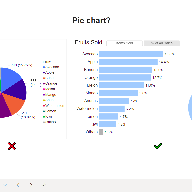
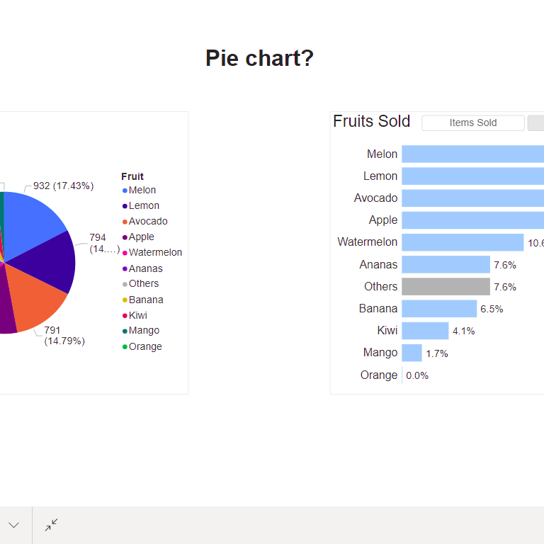
Updated version of my Pie Chart (how not to do) vs Not A Pie Chart (how to do) example. Now there is a Pie Chart … Read More

Colorful Spaghetti Chart?
Data Visualization Data Visualization Examples Storytelling with data

Colorful Spaghetti Chart?

Andrzej Leszkiewicz July 15, 2021
Pie Chart?
Bad and Good Chart in Power BI Data Visualization

Pie Chart?

Andrzej Leszkiewicz July 14, 2021
Pie Chart
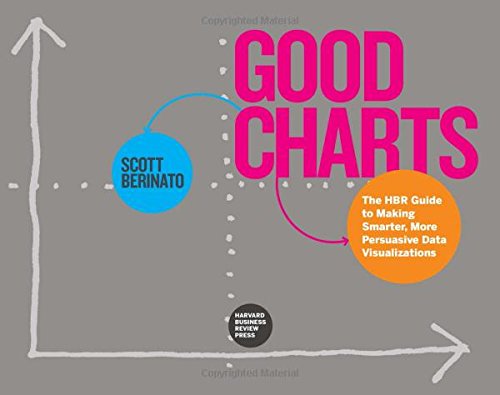
Good Charts: The HBR Guide to Making Smarter, More Persuasive Data Visualizations
Data Visualization Tricks and Workarounds

Good Charts: The HBR Guide to Making Smarter, More Persuasive Data Visualizations

Andrzej Leszkiewicz July 13, 2021

I read multiple books about data visualization (by Edward Tufte, Alberto Cairo, Stephen Few, Cole Nussbaumer Knaflic, Jonathan Schwabish and other authors). Therefore, before buying … Read More

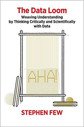
The Data Loom: Weaving Understanding by Thinking Critically and Scientifically with Data
Data Modeling DAX

The Data Loom: Weaving Understanding by Thinking Critically and Scientifically with Data

Andrzej Leszkiewicz July 9, 2021

It is very disappointing to see 1-star reviews on Amazon page for this book. Someone bought a book about critical thinking (!!!) and left 1 … Read More

Stephen Few
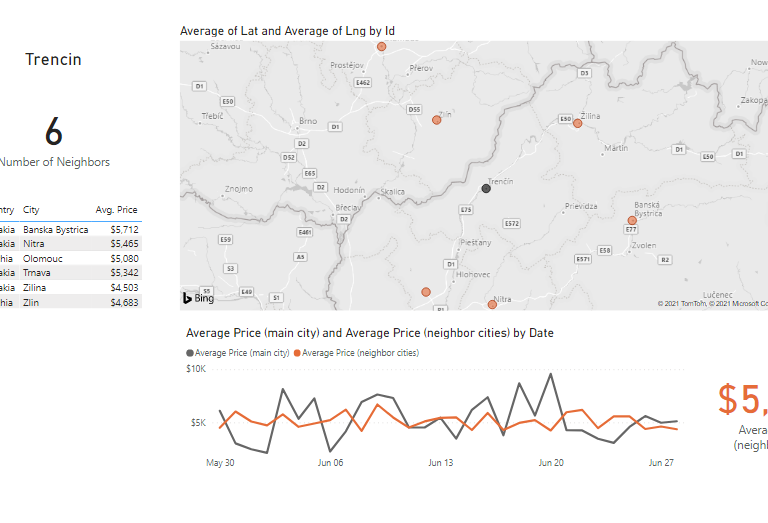
Power BI report to analyze city (property, grocery store etc.) neighbors
Data Visualization Examples Deneb-Vega

Power BI report to analyze city (property, grocery store etc.) neighbors

Andrzej Leszkiewicz June 29, 2021

In this post I want to show an example of a report that uses hierarchy bridge in the data model with recursive hierarchy. If you … Read More
hierarchy bridgerecursive hierarchy

Posts pagination

Previous 1 … 7 8 9 … 11 Next

Newsletter

Recent Posts

  • Should You Build a Custom Power BI Visual?
  • Working with a Power BI Semantic Model Using GitHub Copilot CLI on an Android Phone
  • How Initial Model Selection Affects Subagents in GitHub Copilot
  • Testing AI Reasoning: Converting SVG to Native Chart with Claude Opus 4.6
  • The Real Power of the New Slicers

Categories

  • AI (9)
    • GitHub Copilot (1)
  • Books (3)
  • Consulting (8)
  • Data Modeling (17)
  • Data Preparation (12)
  • Data Visualization (57)
    • Bad and Good Chart in Power BI (7)
    • Data Visualization Examples (24)
    • IBCS (4)
    • Storytelling with data (23)
  • DAX (13)
  • Deneb-Vega (3)
  • Fabric (2)
  • Licensing (3)
  • Performance (11)
  • Power Query and M (11)
  • REST API (5)
  • Sharing and Embedding (16)
  • Tabular Editor (2)
  • Tricks and Workarounds (32)

Selected Visualizations

Power BI Embedded – Live Demo

This is an embedded Power BI Table visual

Read more about Power BI Embedded...

  • Better DataViz
    • Posts about IBCS
    • IBCS in Power BI (native visuals)
    • Bad and good charts in Power BI
    • Storytelling with data in Power BI
  • Deneb and Vega ⭐
    • Posts about Deneb and Vega
    • Deneb and Vega overview
    • Deneb Vega templates
    • Custom Vega visualizations
    • Deneb & Vega help
  • PowerofBI.IBCS
  • Power BI Embedded
  • Power BI Reports 📈
  • Books to Read
  • YouTube
  • About
Proudly powered by WordPress | Theme: BusinessDeal | By Theme Freesia.