Stacked column chart conditional formatting (COVID-19 report)
I have updated my COVID-19 report today.
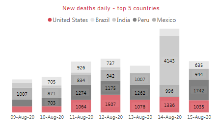
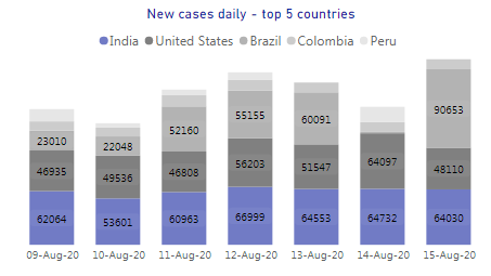
New chart design:
Old chart design:
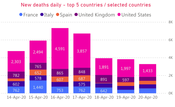
Old version of the chart worked, but it wasn’t perfect because of the colors. For other charts I used red and grey colors for deaths and blue and grey colors for cases:

But for a stacked column chart Power BI by default automatically applies theme colors to all data series:
It works in a sense that colors selected by Power BI provides a good contrast between data series (countries), but it ruins my theme and the colors selected by Power BI do not provide any additional information. I can change colors manually, but in this case it wont work. The chart has to show top 5 countries and I don’t know which 5 countries will be on the top tomorrow. I need to be able to assign different colors to a country rank, not to a country name.
I wanted red and grey colors for deaths and blue and grey for cases:
Where top 1 country by number of new deaths/cases (during last 7 days) is red/blue and top 2-5 countries filled with shades of grey from darker (more cases/deaths or rank = 2) to lighter (less cases/deaths or rank = 5).
But how can I link colors to country rank instead of country name?
The answer is DAX.
I created a DAX table to rank all countries by number of new deaths/cases (during last 7 days). I ranked top 5 countries as 1-5 and all other countries as 6 (column Index):
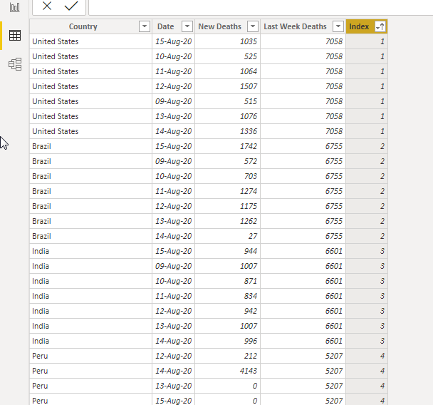
Number 6 is required for a case when the chart will be filtered to show other than one of top 5 countries.
Top 5 Countries by Deaths =VAR _date =
MAX ( COVID19[Date] ) – 6
VAR _7days_data =
FILTER ( COVID19, COVID19[Date] >= _date )
VAR _7days_data_grouped =
SELECTCOLUMNS (
SUMMARIZE (
_7days_data,
COVID19[Country/Region],
‘COVID19′[Date],
“Daily Deaths”, SUM ( ‘COVID19′[New Deaths] )
),
“Country”, [Country/Region],
“Date”, [Date],
“New Deaths”, [Daily Deaths]
)
VAR _7days_data_exp =
ADDCOLUMNS (
_7days_data_grouped,
“Last Week Deaths”, CALCULATE (
SUM ( COVID19[New Deaths] ),
FILTER ( COVID19, COVID19[Date] >= _date ),
FILTER ( COVID19, COVID19[Country/Region] = [Country] )
)
)
VAR _7days_data_ranked =
ADDCOLUMNS (
_7days_data_exp,
“Index”, (
MIN ( RANKX ( _7days_data_exp, ( [Last Week Deaths] ) – 1 ) / 7 + 1, 6 )
)
)
RETURN
_7days_data_ranked
I created 2 tables (one for deaths and one for cases), but they can be merged into one table.
Then I linked both tables to my Countries table to make sure that all country based filters will work with the new charts:
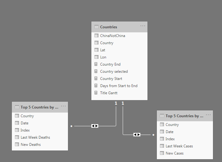
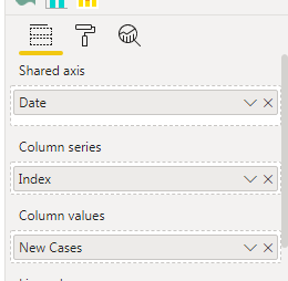
Now I can use my new tables as data sources for my ‘New deaths – top 5 countries’ and ‘New cases – top 5 countries’ charts. And column Index can be used to define data series (instead of country names):
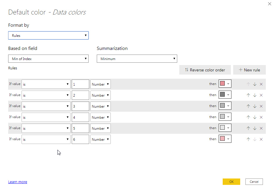
And I can assign country colors to a country rank (Index value):
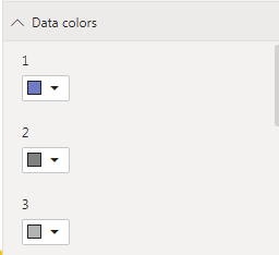
But it brings a new problem. Chart legend will show numbers from 1 to 6 instead of country names.
I had to create one more chart which uses country field to define categories (it can be any chart type which allows conditional colors for data categories) with all extra elements (axis X, axis Y, title and so on) disabled. And I resized it so only legend is visible and inserted it in front of the main chart legend:
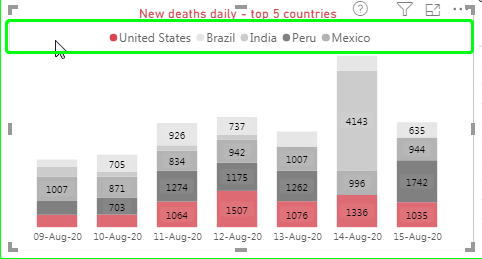
I applied conditional colors to the ‘legend’ chart to make sure there is a match between ‘legend’ chart colors and main chart colors:
And if any other than one of the top 5 countries selected then same red (for deaths) or blue (for cases) color will be applied to all countries (because all of them have Index = 6).
This is what I needed, because in old version of the report all possible colors have been applied by Power BI to such countries.
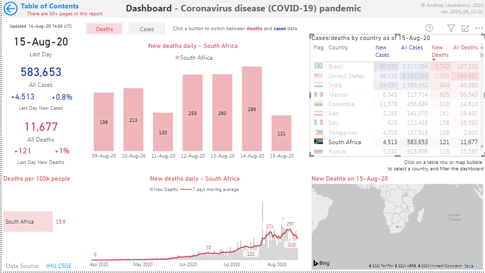
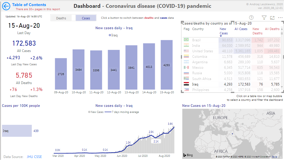
And this is the updated dashboard:
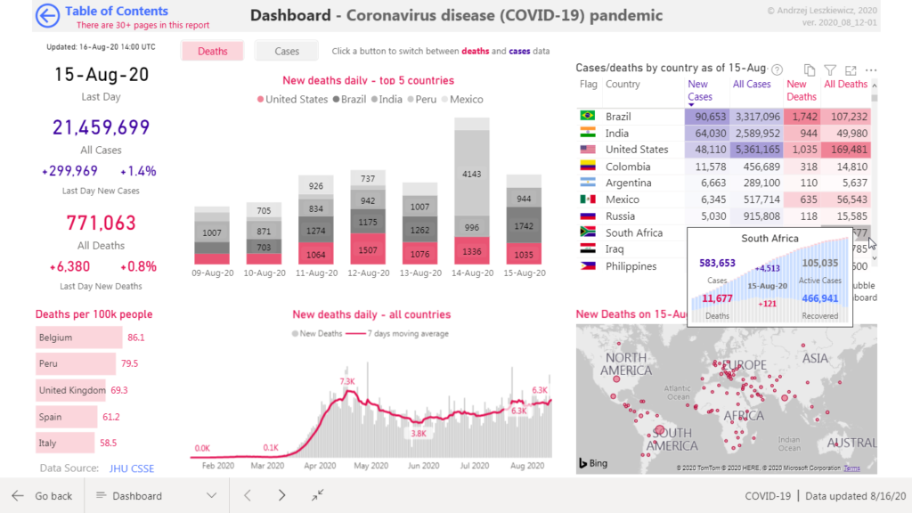
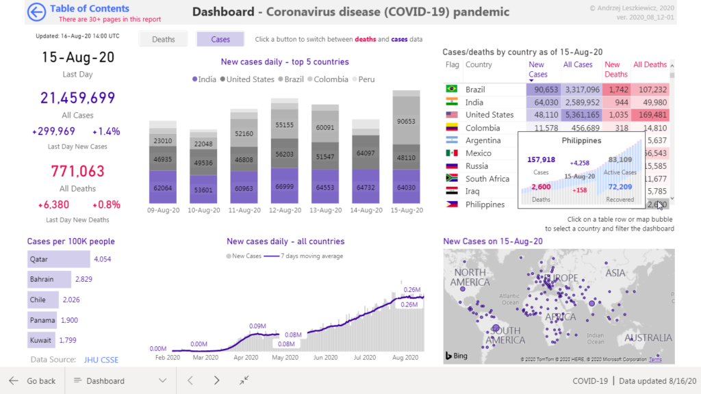
Almost perfect now 🙂
Live report: