Line and stacked column chart with outliers
In this post I’ll show how to handle a time series of data with outliers (extremely high values). For example, number of new COVID-19 deaths reported for some dates is significantly bigger compare to the daily average of the previous and following dates. It happens when, for example, earlier unreported number of deaths in nursing homes is included into one of the daily reports.
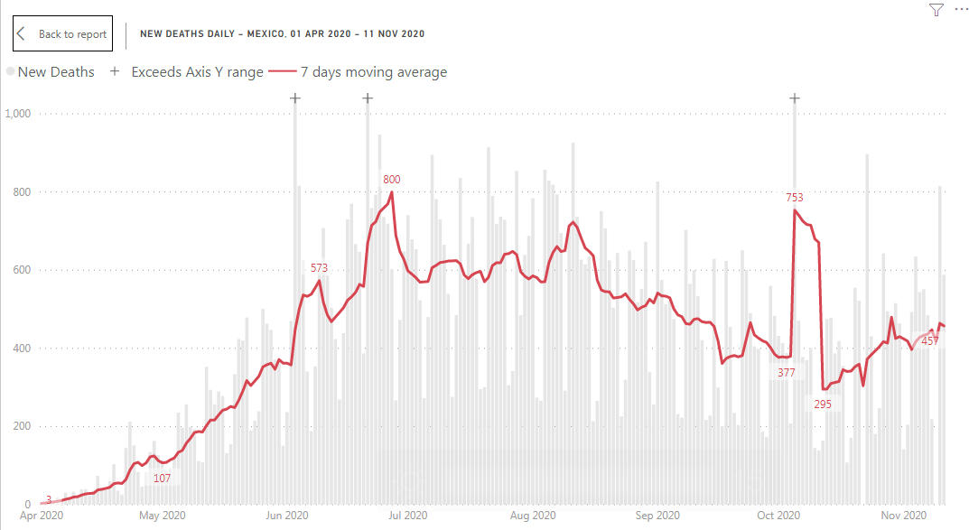
This is how a time series of COVID-19 deaths looks for Mexico:
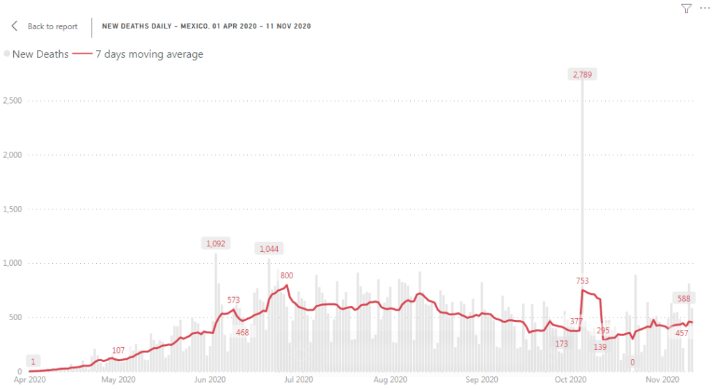
Gray columns – number of deaths reported (daily data), red line – 7 days moving average. One column on the graph is extremely high compare to the rest of the graph. Why it’s a problem? This kind of outliers are squeezing the chart: while we can show rest of the data using axis Y with a range between 0 and 1000 deaths, we need a range between 0 and almost 3000 deaths to show number of deaths reported on October 5. An outlier squeezed the rest of the graph and made patterns less readable. In more extreme case an outlier will make the rest of the data totally unreadable.
This problem can be solved by just removing daily numbers and showing 7 days moving overage. But in a case of COVID-19 report I want to show both daily numbers and 7 days moving average. Daily numbers have a weekly pattern and by looking at the gray columns it’s easy to understand this pattern. And the pattern explains why 7 days moving average is so important and why we shouldn’t make any assumptions from daily variations.
This is why I used another solution. I decided to trim outliers (extremely tall columns) and mark the trimmed columns using ‘+’ marker.
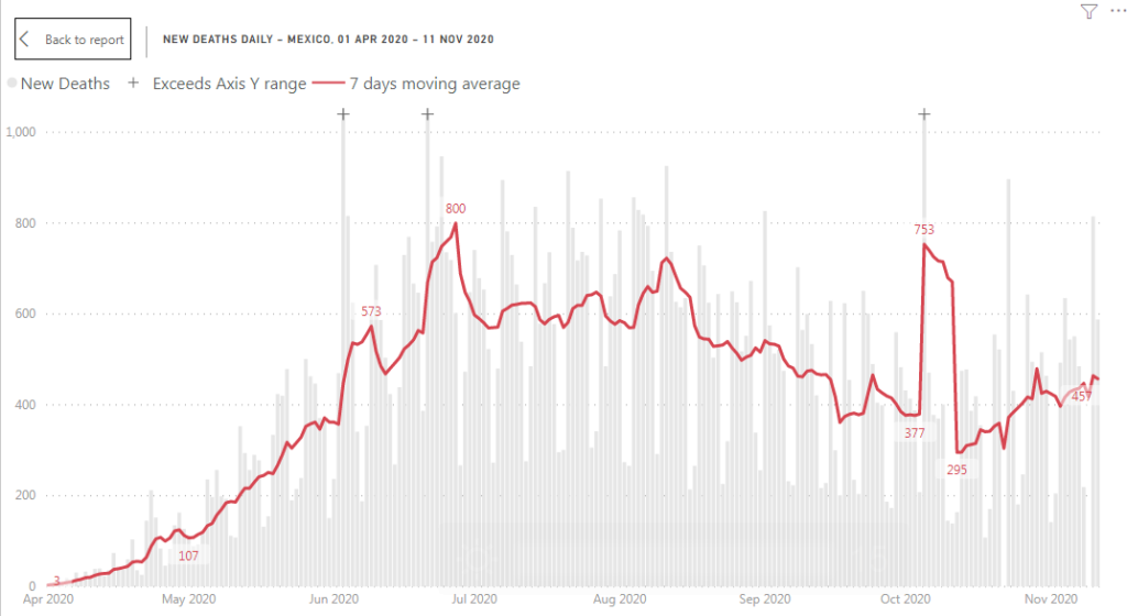
Now you can see that all daily changes and weekly pattern are more readable and we have 3 outliers marked with ‘+’ character on the top of a column. It means that the column supposed to be higher, but it exceeds axis Y range. In the report you can just hover over the column to read column value on the tool-tip.
How it was implemented? We need to trim columns and we need to mark trimmed columns with ‘+’ character on the top.
- I’ve decided that I’ll treat any value higher than 130% of the maximal point on the 7 days moving average line as an outlier. If a value is greater than 130% of the highest 7 days moving average than a corresponding column will be trimmed.
So, instead of using number of deaths ‘COVID19′[New Deaths] I’ve used the following measure as a column value:
New deaths below limit :=VAR _limit =
MAXX (
ADDCOLUMNS ( ALLSELECTED ( ‘COVID19′[Date] ), “avg”, [New deaths moving avg] ),
[avg]
) * 1.3
VAR _value =
IF (
SUM ( ‘COVID19′[New Deaths] ) <= _limit,
SUM ( ‘COVID19′[New Deaths] ),
_limit
)
RETURN
_value
_limit variable is a maximum of 7 days moving average (the highest point of the red line) multiplied by 1.3.
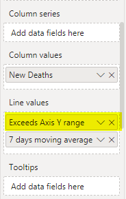
The measure returns either number of deaths (if it’s below the limit) or _limit value. I added this measure into ‘Column values’ field of a line and stacked column chart (renamed to ‘New Deaths’):
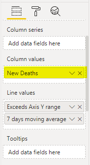
My second measure returns either _limit value for the days with an outlier or nothing (blank).
New cases exceed limit :=VAR _limit =
MAXX (
ADDCOLUMNS ( ALLSELECTED ( ‘COVID19′[Date] ), “avg”, [New cases moving avg] ),
[avg]
) * 1.3
VAR _value =
IF ( SUM ( ‘COVID19′[New Confirmed Cases] ) > _limit, _limit, BLANK () )
RETURN
_value
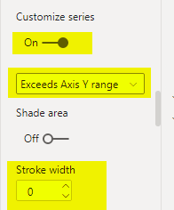
This measure I used to show ‘+’ markers on the top of trimmed columns. I added it as a line series (reamed to ‘Exceeds Axis Y range).
Then I just formatted this line to be invisible
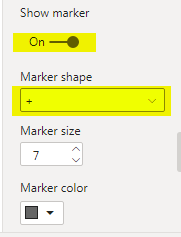
and added ‘+’ markers
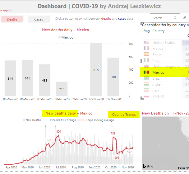
To see live charts created using this method just select a country on the following dashboard
and then see the ‘New deaths daily’ chart or better click ‘Country Trends’ button to open new cases and new deaths daily charts full page.