Update Power BI Dataset (Semantic Model) More Than 8 Times a Day (Without Premium)
It’s not possible to refresh a dataset more than 8 times a day (shared capacity). However, it is possible to have a report with data … Read More
Blog by Andrzej Leszkiewicz. Power BI Developer and Consultant.
Power of Business Intelligence
Blog by Andrzej Leszkiewicz. Power BI Developer and Consultant.
It’s not possible to refresh a dataset more than 8 times a day (shared capacity). However, it is possible to have a report with data … Read More
Your BI report isn’t “cool”? It lacks “cool” backgrounds, effects (3D, shades, gradients), and “cool” images and icons, etc.? Do you want to make your … Read More
Features useful for creating better user experiences: ➡️ Legends, labels that become visible during a mouse hover event over a chart element. For example, hover … Read More
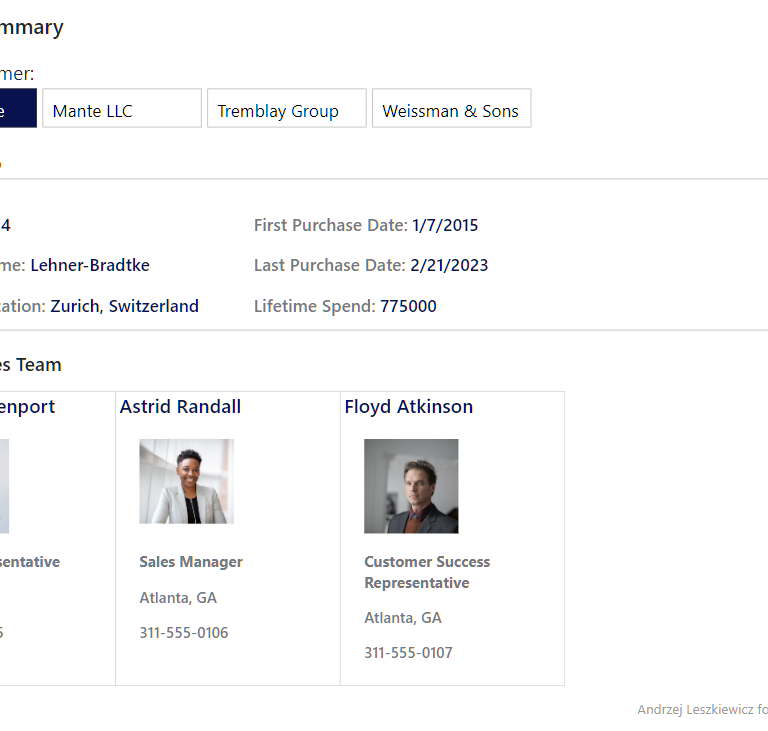
My version of WOW2024 Week 12 contact cards report created using only core visuals. The introduction of the challenge says “This week’s challenge uses a … Read More
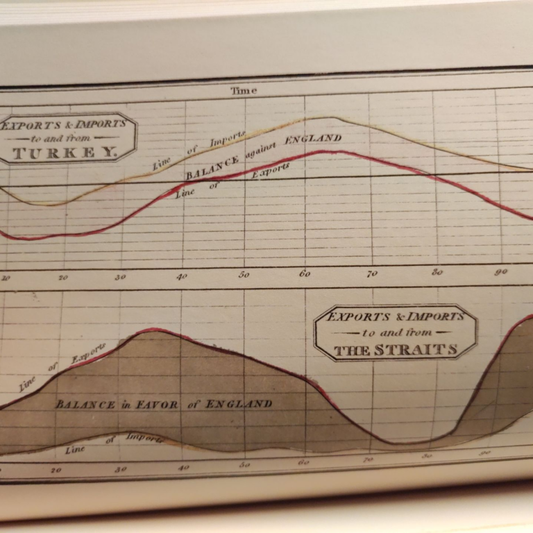
Playfair’s charts, from the end of the 18th century to the beginning of the 19th century utilized single-color hand-engraved copperplate printing with the following hand-staining … Read More
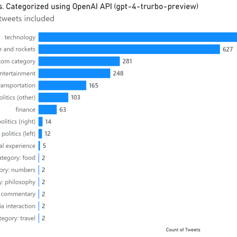
Carlos Barboza is experimenting with visualizing Elon Musk’s activity on Twitter. That looks really great, but I wanted to see more than just quantity; I … Read More
There are many excellent data visualization books that help create better charts. However, data visualization professionals, including Power BI developers, often create dashboards (or “reports” … Read More
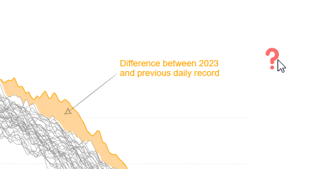
💁♂️Question: I have found that many struggle to completely understand the meaning of an IBCS visual with so much “busy-ness” with labels and arrows It’s … Read More
➡ I experiment and play with Power BI.➡ I follow people who experiment and play with Power BI.➡ When I see an interesting know-how I … Read More