Which Chart Type is Better? A Dangerous DataViz Pitfall.
I’ve just (almost) fallen into a dangerous data visualization pitfall. It was a usual LinkedIn discussion of a data visualization experiment. I realize that the … Read More
Power of Business Intelligence
Blog by Andrzej Leszkiewicz. Power BI Developer and Consultant.
Power of Business Intelligence
Blog by Andrzej Leszkiewicz. Power BI Developer and Consultant.
I’ve just (almost) fallen into a dangerous data visualization pitfall. It was a usual LinkedIn discussion of a data visualization experiment. I realize that the … Read More
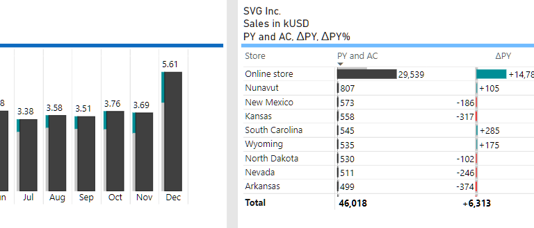
International Business Communication Standards (https://www.ibcs.com/ibcs-standards-1-2/) recommends: “Numbers with more than three digits in charts and four digits in tables are hard to read; moreover, such … Read More
While explanatory reports should be intuitively easy to understand without any legends and tutorials, tools for data exploration may benefit from some complexity and therefore … Read More
The following chart has been rendered using the most recent code version from my Github Deneb-Vega repository. Copy URL to this page/chart to clipboard
The Financial Times is a source of great data-driven stories told through data visualization. The Financial Times vocabulary poster is a simple yet comprehensive tool … Read More
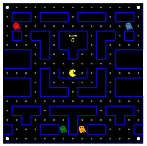
Just a joke. But it opens great data visualization possibilities. Everything (almost) is possible. You know the rules. Use arrows to move around the visual. … Read More
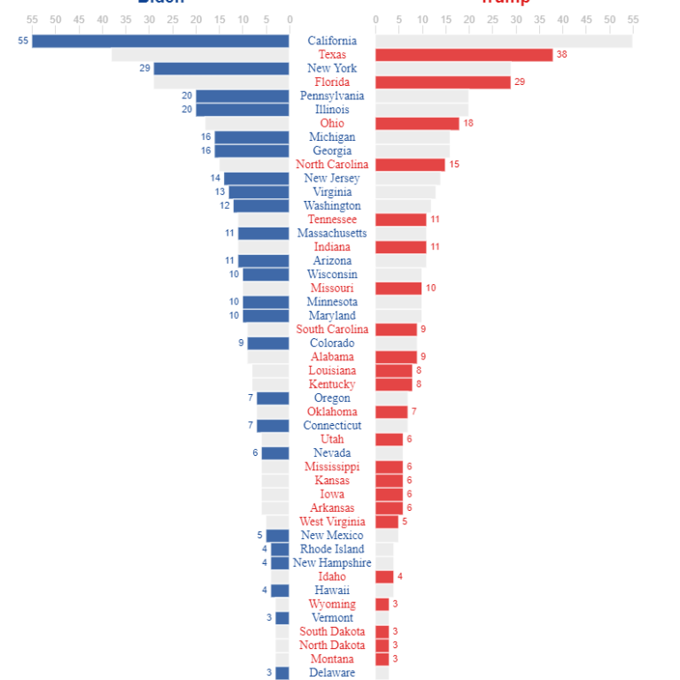
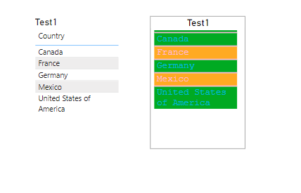
I love Power BI community for the inspiration it gives. Today after reading this LinkedIn post by Jan Schroeven I realized that if Power BI … Read More
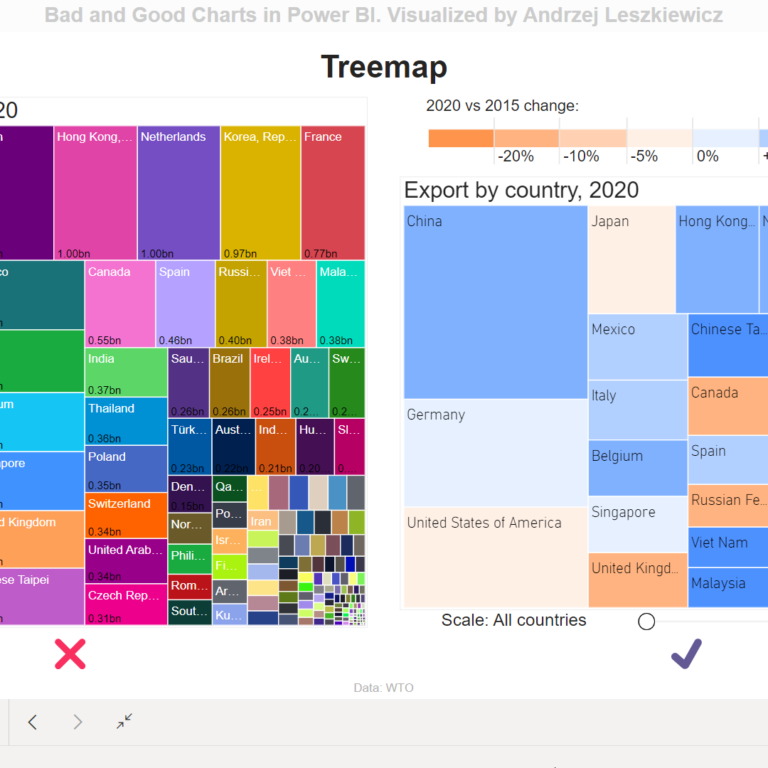
How to show almost 200 countries data on a treemap visual? For this experiment I took international trade statistics (merchandise exports by product group, annual) … Read More
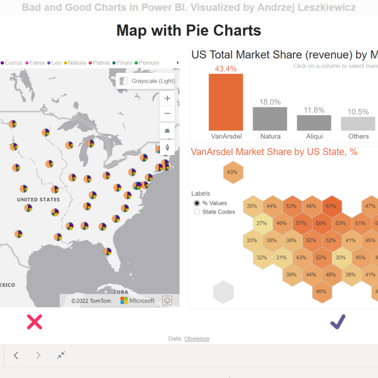
In Add a pie chart layer Azure documentation article you will learn how to add a pie chart layer to an Azure Maps Power BI … Read More
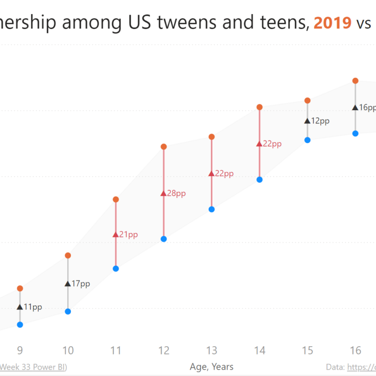
It started with @shan_gsd‘s tweet about Year 2022 Week 33 of the Workout Wednesday and @CJMajka‘s reply “A dumbbell chart in #PowerBI?! That is kind … Read More