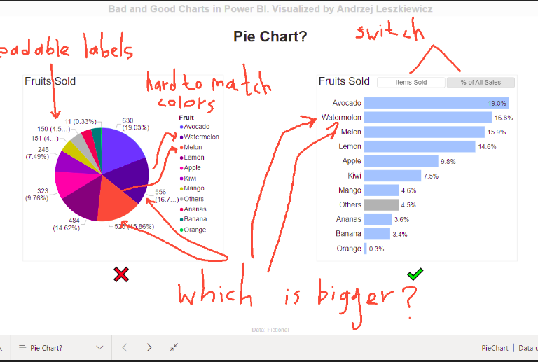
Adding handwriting comments and drawings to Power BI report
I’ve started reading ‘The Back of the Napkin’ book by Dan Roam and realized that I literally can use ‘virtual napkins’ in my Power BI … Read More
Power of Business Intelligence
Blog by Andrzej Leszkiewicz. Power BI Developer and Consultant.
Power of Business Intelligence
Blog by Andrzej Leszkiewicz. Power BI Developer and Consultant.
I’ve started reading ‘The Back of the Napkin’ book by Dan Roam and realized that I literally can use ‘virtual napkins’ in my Power BI … Read More
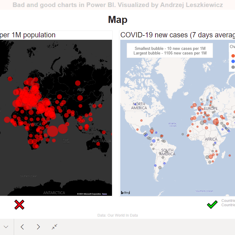
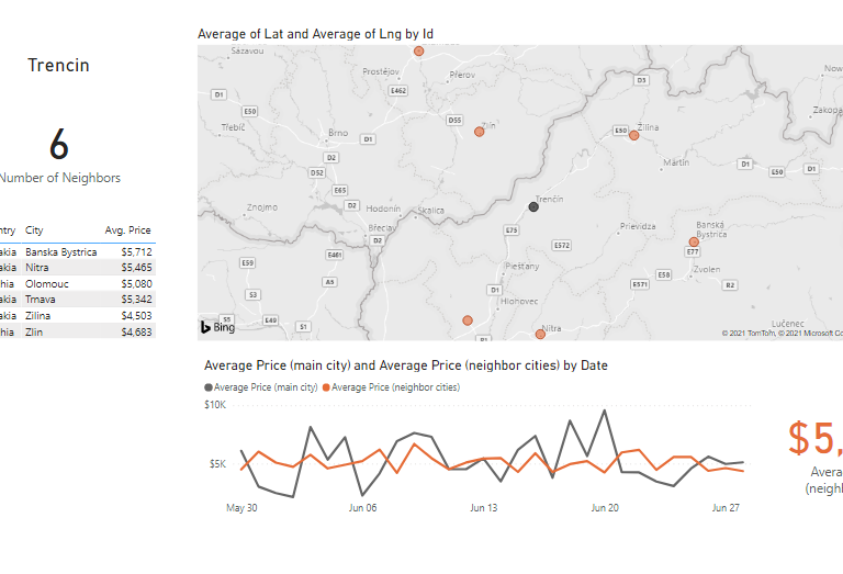
Did you see a map like the map on the left? A map like this was used as a main visual on one of the … Read More
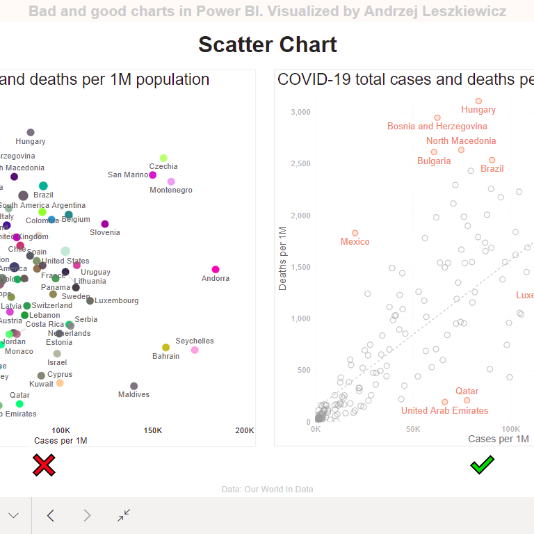
I read multiple books about data visualization (by Edward Tufte, Alberto Cairo, Stephen Few, Cole Nussbaumer Knaflic, Jonathan Schwabish and other authors). Therefore, before buying … Read More
In this post I want to show an example of a report that uses hierarchy bridge in the data model with recursive hierarchy. If you … Read More
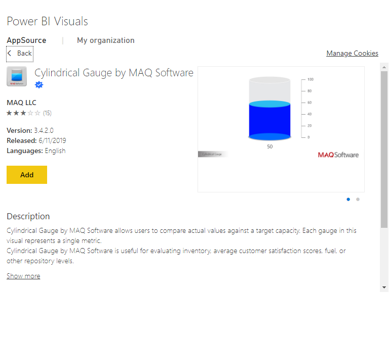
I was writing just a comment (about 3D cursed BI tools) in LinkedIn, but it’s going to be more than just a short comment, so … Read More
If your job is to talk with people about numbers (any numbers: profit and loss, salary, election results, number of stars in the universe) then … Read More
I usually don’t read books with step by step instruction like “click File, then click Open”. I start working with a new tool right away … Read More