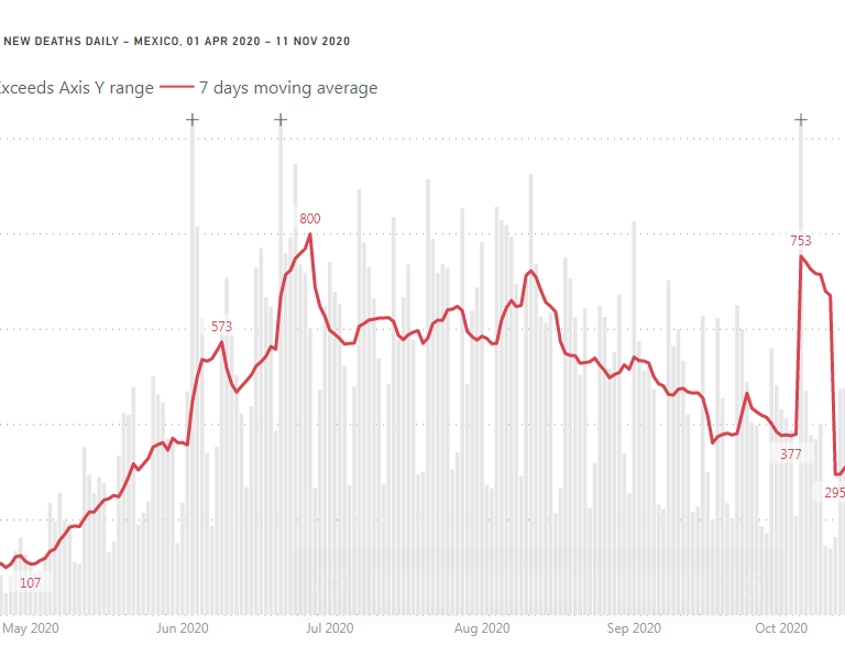
Line and stacked column chart with outliers
In this post I’ll show how to handle a time series of data with outliers (extremely high values). For example, number of new COVID-19 deaths … Read More
Power of Business Intelligence
Blog by Andrzej Leszkiewicz. Power BI Developer and Consultant.
Power of Business Intelligence
Blog by Andrzej Leszkiewicz. Power BI Developer and Consultant.
In this post I’ll show how to handle a time series of data with outliers (extremely high values). For example, number of new COVID-19 deaths … Read More
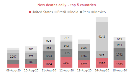
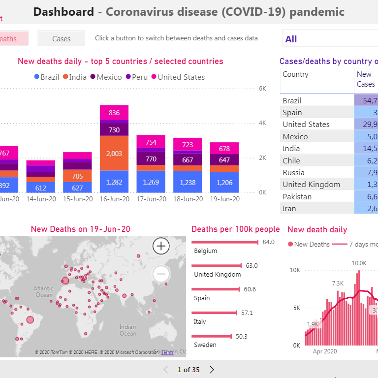
I have updated my COVID-19 report today. New chart design: Old chart design: Old version of the chart worked, but it wasn’t perfect because of … Read More
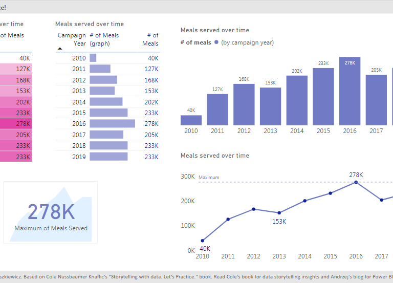
Storytelling with data in Power BIStorytelling with data in Power BI: part 2 So far I have created 11 pages report (+ title page) with … Read More
Since my first post about storytelling in Power BI I’ve created first 8 pages of the report : In some cases you may want to … Read More
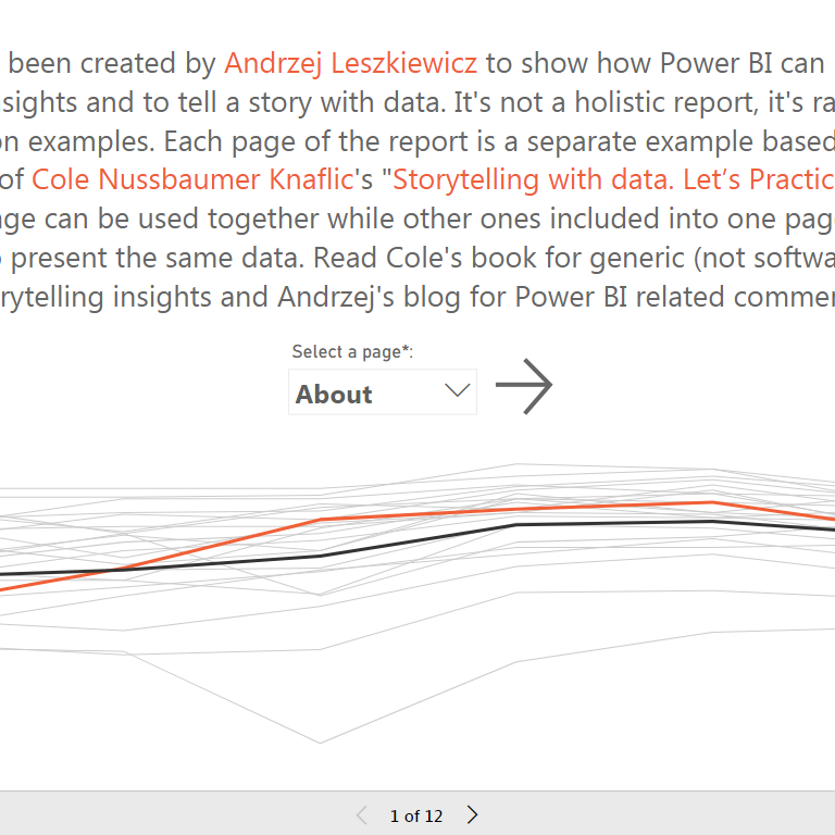
I’m starting a series of posts based on “Storytelling with data. Let’s Practice.” book by Cole Nussbaumer Knaflic. The visuals that illustrate exercise solutions in … Read More
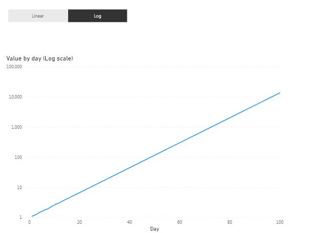
There are 2 ways to switch between linear and log scale: we can use bookmarks to switch between 2 different charts we can use DAX … Read More
No Power BI tips and tricks in this article. Just a few words about data management. Pandemic and chaotic data management. If you’re interested in … Read More