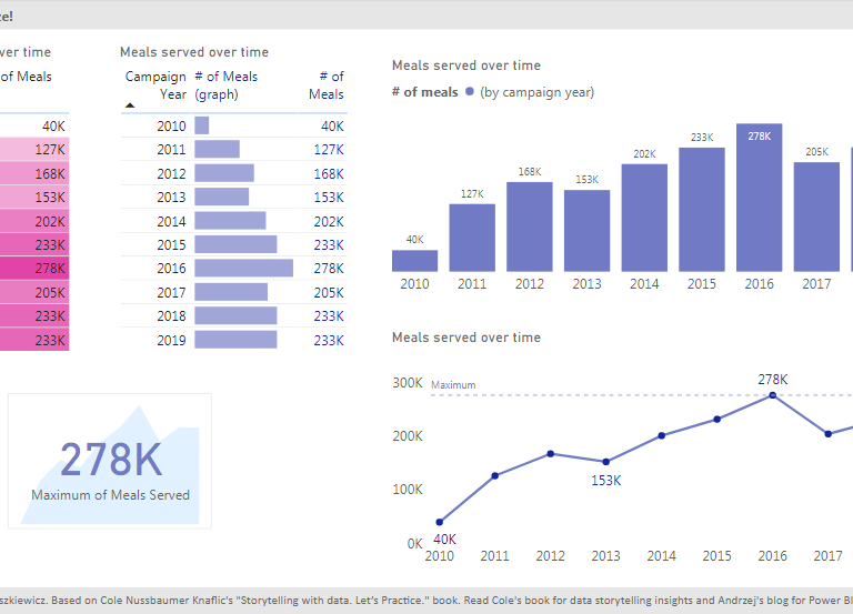
Skip to content
Power of Business Intelligence

Power of Business Intelligence

Blog by Andrzej Leszkiewicz. Power BI Developer and Consultant.

  • Better DataViz
    • Posts about IBCS
    • IBCS in Power BI (native visuals)
    • Bad and good charts in Power BI
    • Storytelling with data in Power BI
  • Deneb and Vega ⭐
    • Posts about Deneb and Vega
    • Deneb and Vega overview
    • Deneb Vega templates
    • Custom Vega visualizations
    • Deneb & Vega help
  • PowerofBI.IBCS
  • Power BI Embedded
  • Power BI Reports 📈
  • Books to Read
  • YouTube
  • About
Power of Business Intelligence

Power of Business Intelligence

Blog by Andrzej Leszkiewicz. Power BI Developer and Consultant.

  • Better DataViz
    • Posts about IBCS
    • IBCS in Power BI (native visuals)
    • Bad and good charts in Power BI
    • Storytelling with data in Power BI
  • Deneb and Vega ⭐
    • Posts about Deneb and Vega
    • Deneb and Vega overview
    • Deneb Vega templates
    • Custom Vega visualizations
    • Deneb & Vega help
  • PowerofBI.IBCS
  • Power BI Embedded
  • Power BI Reports 📈
  • Books to Read
  • YouTube
  • About
A power BI report that displays its own metadata, including refresh history
Data Preparation Power Query and M

A power BI report that displays its own metadata, including refresh history

Andrzej Leszkiewicz February 1, 2021

A crazy Power BI idea is in my head. It rather doesn’t make much practical sense, but such crazy ideas sometimes lead to useful solutions for the … Read More

PowerShellREST API
PowerShell script to publish Power BI reports into multiple tenants
Sharing and Embedding Tricks and Workarounds

PowerShell script to publish Power BI reports into multiple tenants

Andrzej Leszkiewicz January 27, 2021

I’m working with multiple Power BI tenants, workspaces and reports. It’s a pain to log out (I’m always logged in with an account for previous report), copy … Read More

PowerShell
Line and stacked column chart with outliers
Data Visualization Tricks and Workarounds

Line and stacked column chart with outliers

Andrzej Leszkiewicz November 12, 2020

In this post I’ll show how to handle a time series of data with outliers (extremely high values). For example, number of new COVID-19 deaths … Read More

Column ChartCOVID-19Line Chart
Stacked column chart conditional formatting (COVID-19 report)
Data Visualization Examples Storytelling with data

Stacked column chart conditional formatting (COVID-19 report)

Andrzej Leszkiewicz August 16, 2020

I have updated my COVID-19 report today. New chart design: Old chart design: Old version of the chart worked, but it wasn’t perfect because of … Read More

Who is a data storyteller? A composer or a musician?
DAX

Who is a data storyteller? A composer or a musician?

Andrzej Leszkiewicz August 8, 2020

I’ve been mentioned and a link to my blog has been shared by SWD (thank you!). The post itself and a few comments under the … Read More

Storytelling with data in Power BI: part 3
Data Visualization Examples Storytelling with data

Storytelling with data in Power BI: part 3

Andrzej Leszkiewicz July 30, 2020

Storytelling with data in Power BIStorytelling with data in Power BI: part 2 So far I have created 11 pages report (+ title page) with … Read More

Data Visualization Examples Storytelling with data

Storytelling with data in Power BI: part 2

Andrzej Leszkiewicz July 23, 2020

Since my first post about storytelling in Power BI I’ve created first 8 pages of the report : In some cases you may want to … Read More

Storytelling with data in Power BI: part 1
Data Visualization Data Visualization Examples

Storytelling with data in Power BI: part 1

Andrzej Leszkiewicz July 13, 2020

I’m starting a series of posts based on “Storytelling with data. Let’s Practice.” book by Cole Nussbaumer Knaflic. The visuals that illustrate exercise solutions in … Read More

Power BI: toggle button to switch between linear and log scale
Data Modeling Data Visualization Examples

Power BI: toggle button to switch between linear and log scale

Andrzej Leszkiewicz July 9, 2020

There are 2 ways to switch between linear and log scale: we can use bookmarks to switch between 2 different charts we can use DAX … Read More

DAX
Consulting

How a potential client can estimate a level of experience of Power BI developer?

Andrzej Leszkiewicz July 6, 2020

Power BI related job post on Upwork: “Please send me examples of your previous works (links, screenshots, pdf) including technologies with estimates how much time … Read More

Posts pagination

Previous 1 … 9 10 11 Next

Newsletter

Recent Posts

  • Testing AI Reasoning: Converting SVG to Native Chart with Claude Opus 4.6
  • The Real Power of the New Slicers
  • Testing an MCP server
  • Top N + Others Without Any Changes in the Data Model
  • Responsive SVG Charts in Power BI Core Visuals

Categories

  • AI (6)
  • Books (3)
  • Consulting (8)
  • Data Modeling (17)
  • Data Preparation (12)
  • Data Visualization (56)
    • Bad and Good Chart in Power BI (7)
    • Data Visualization Examples (24)
    • IBCS (4)
    • Storytelling with data (23)
  • DAX (13)
  • Deneb-Vega (3)
  • Fabric (2)
  • Licensing (3)
  • Performance (11)
  • Power Query and M (11)
  • REST API (5)
  • Sharing and Embedding (16)
  • Tabular Editor (2)
  • Tricks and Workarounds (32)

Selected Visualizations

Power BI Embedded – Live Demo

This is an embedded Power BI Table visual

Read more about Power BI Embedded...

  • Better DataViz
    • Posts about IBCS
    • IBCS in Power BI (native visuals)
    • Bad and good charts in Power BI
    • Storytelling with data in Power BI
  • Deneb and Vega ⭐
    • Posts about Deneb and Vega
    • Deneb and Vega overview
    • Deneb Vega templates
    • Custom Vega visualizations
    • Deneb & Vega help
  • PowerofBI.IBCS
  • Power BI Embedded
  • Power BI Reports 📈
  • Books to Read
  • YouTube
  • About
Proudly powered by WordPress | Theme: BusinessDeal | By Theme Freesia.