Dashboards with Better User Experiences
Features useful for creating better user experiences: ➡️ Legends, labels that become visible during a mouse hover event over a chart element. For example, hover … Read More
Power of Business Intelligence
Blog by Andrzej Leszkiewicz. Power BI Developer and Consultant.
Power of Business Intelligence
Blog by Andrzej Leszkiewicz. Power BI Developer and Consultant.
Features useful for creating better user experiences: ➡️ Legends, labels that become visible during a mouse hover event over a chart element. For example, hover … Read More
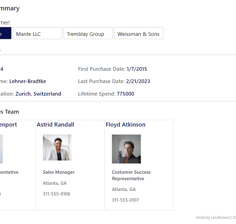
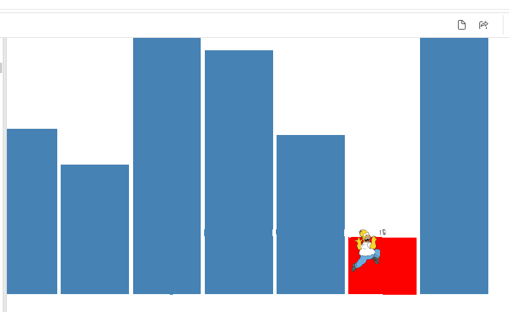
My version of WOW2024 Week 12 contact cards report created using only core visuals. The introduction of the challenge says “This week’s challenge uses a … Read More
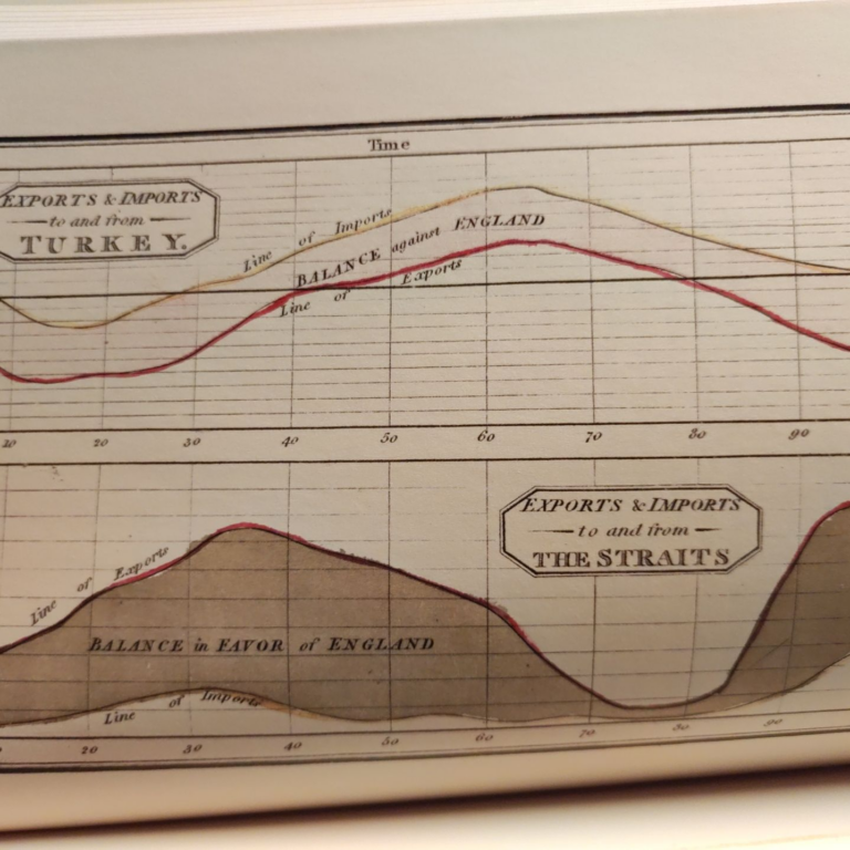
Playfair’s charts, from the end of the 18th century to the beginning of the 19th century utilized single-color hand-engraved copperplate printing with the following hand-staining … Read More
There are many excellent data visualization books that help create better charts. However, data visualization professionals, including Power BI developers, often create dashboards (or “reports” … Read More
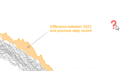
💁♂️Question: I have found that many struggle to completely understand the meaning of an IBCS visual with so much “busy-ness” with labels and arrows It’s … Read More
➡ I experiment and play with Power BI.➡ I follow people who experiment and play with Power BI.➡ When I see an interesting know-how I … Read More
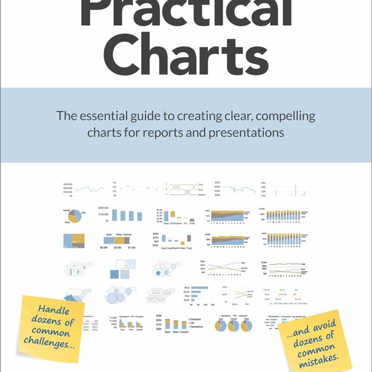
Nick Desbarats’s Practical Charts is an amazing and really practical book that will help you make good charts. Extremely high-quality content on high-quality (heavy!) paper, … Read More
Many people are excited to see my IBCS-styled Power BI data visualizations. They look cool! However, not everyone understands why some columns are solid black, … Read More
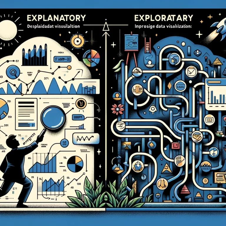
There are explanatory and exploratory data visualizations. One tells a story and therefore needs a story, while the other helps to find a story or … Read More